
CSS学习
简介
- CSS为层叠样式表
- 样式定义如何显示HTML元素,多个样式可以层叠为一个
- 样式存储于样式表中
语法
CSS 规则由两个主要的部分构成:选择器,以及一条或多条声明:
h1 		{color:blue;front-size:12px;}
/*选择器  属性:值     其他注释内容*/
选择器
id选择器(ID selector,IS)
id 选择器可以为标有特定 id 的 HTML 元素指定特定的样式。
HTML元素以id属性来设置id选择器,CSS 中 id 选择器以 “#” 来定义。
以下的样式规则应用于元素属性 id=“para1”:
#para1
{
    text-align:center;
    color:red;
}
ID属性不要以数字开头,数字开头的ID在 Mozilla/Firefox 浏览器中不起作用
class选择器(class selector,CS)
class 选择器用于描述一组元素的样式,class 选择器有别于id选择器,class可以在多个元素中使用。选择时多个单词中间用.代替空格分隔,建立是用空格分隔
class 选择器在HTML中以class属性表示, 在 CSS 中,类选择器以一个点"."号显示:
.center {text-align:center;}
也可以指定特定的HTML元素使用class。
在以下实例中, 所有的 p 元素使用 class=“center” 让该元素的文本居中:
p.center {text-align:center;}
元素选择器(element selector,ES)
h1 {color:blue;front-size:12px;}
内联样式(element selector,ES)
<h3 style="color:red;">test</h3>
在 CSS3 中包含了四种组合方式:
- 后代选择器(以空格 分隔)
- 子元素选择器(以大于 > 号分隔)
- 相邻兄弟选择器(以加号 + 分隔)
- 普通兄弟选择器(以波浪号 ~ 分隔)
包含选择器(package selector,PS)
指定目标选择器必须处在某个选择器对应的元素内部,语法格式:A B{…}(A、B为HTML元素/标签,表示对处于A中的B标签有效)
<style>
p{
  color:red;
}
div p{
  color:yellow;
}
</style>
<p>red text</p><!--文字是红色的-->
<div>
  <p>yellow text</p><!--文字是黄色的-->
</div>
.A B{…} 的形式(A是类名,B是标签) 会使 class 名为 A 的标签里面所有名为 B 的子代标签的内容按照设定的内容显示。
<style>
.first span{
  color:red;
}
</style>
<body>
<p class="first"><span>内容为红色</span>
<ol>
  <li><span>内容也是红色</span></li>
  <li><span>内容也是红色</span></li>
</ol></p>

</body>
子选择器(sub-selector,SS)
类似于包含选择器,指定目标选择器必须处在某个选择器对应的元素内部,两者区别在于包含选择器允许"子标签"甚至"孙子标签"及嵌套更深的标签匹配相应的样式,而子选择器强制指定目标选择器作为 包含选择器对应的标签 内部的标签,语法格式**:A>B{…}**(A、B为HTML元素/标签)。例:以下div内的p标签匹配样式,div内的table内的p不匹配
<style>
div>p{
  color:red;
}
</style>
<div>
  <p>red text</p><!--文字是红色的-->
  <table>
    <tr>
      <td>
        <p>no red text;</p><!--文字是非红色的-->
      </td>
    </tr>
  </table>
</div>
.A >B{…} 的形式(A是类名,B是标签)
会使 class 为 A 的标签里面所有名为 B 的直接子代标签的内容按照设定的内容显示。而非直接子代的 B 标签的内容是不会改变的。
<style>
.first>span{
  color:red;
}
</style>
<body>
<p class="first"><span>内容为红色</span>
<ol>
  <li><span>内容不是红色</span></li>
  <li><span>内容不是红色</span></li>
</ol></p>

</body>
兄弟选择器(brother selector,BS)
BS是CSS3.0新增的一个选择器,语法格式:A~B{…}(A、B为HTML元素/标签,表示A标签匹配selector的A,B标签匹配selector的B时,B标签匹配样式)
相邻兄弟选择器**div+p**可选择紧接在另一元素后的元素,且二者有相同父元素。
后续兄弟选择器**div~p**选取所有指定元素之后的相邻兄弟元素。
<style>
div~p{
  color:red;
}
</style>
<div>
  <p>no red text</p><!--文字是非红色的-->
  <div>no red text</div>
  <p>red text</p><!--文字是红色的-->
</div>
分组选择器
h1,h2,p
{
    color:green;
}
嵌套选择器
- p{ }: 为所有 p 元素指定一个样式。
- .marked{ }: 为所有 class=“marked” 的元素指定一个样式。
- .marked p{ }: 为所有 class=“marked” 元素内的 p 元素指定一个样式。
- p.marked{ }: 为所有 class=“marked” 的 p 元素指定一个样式
p
{
    color:blue;
    text-align:center;
}
.marked
{
    background-color:red;
}
.marked p
{
    color:white;
}
p.marked{
    text-decoration:underline;
}
通用选择器
匹配 html 中的所有元素标签
<!--使用html中任意标签元素字体颜色全部设置为红色:-->
<style>
*{color:red;}
</style>

<body>
<h1>标题为红色</h1>
<p>段落也为红色</p>
</body>
a,b{…………}一个id叫a和一个标签是b的样式
a b{…………}一个id叫a下面的一个标签是b的样式
a:b{…………}一个id叫a的伪类b,例如:a:hover
a.b{…………}一个id叫a的下面的class叫b的样式
优先级
内部>id>class>元素
插入样式表
CSS 可以通过以下方式添加到HTML中:
- 内联样式- 在HTML元素中使用"style" 属性
- 内部样式表 -在HTML文档头部
<head>区域使用<style>元素 来包含CSS - 外部引用 - 使用外部 CSS 文件
内联样式
当样式仅需要在一个元素上应用一次时
<!-- 定义元素颜色-->
<body style="background-color:yellow;">
<h2 style="background-color:red;">这是一个标题</h2>
<p style="background-color:green;">这是一个段落。</p>
</body>
<body style="background-color:yellow;"
内部样式表
当单个文档需要特殊的样式
<head>
<style type="text/css">
body {background-color:yellow;}
p {color:blue;}
</style>
</head>
外部样式表
可以通过改变一个文件来改变整个站点的外观
<head>
<link rel="stylesheet" type="text/css" href="mystyle.css">
</head>
多重样式
(内联样式)Inline style > (内部样式)Internal style sheet >(外部样式)External style sheet > 浏览器默认样式
内联样式 > id 选择器 > 类选择器 = 伪类选择器 = 属性选择器 > 标签选择器 = 伪元素选择器
注意:如果外部样式放在内部样式的后面,则外部样式将覆盖内部样式
背景
背景颜色
background-color 属性定义了元素的背景颜色.页面的背景颜色使用在body的选择器中:
body {background-color:#b0c4de;}

h1 {background-color:#6495ed;}
p {background-color:#e0ffff;}
div {background-color:#b0c4de;}
CSS中,颜色值通常以以下方式定义:
- 十六进制 - 如:“#ff0000”
- RGB - 如:“rgb(255,0,0)”
- 颜色名称 - 如:“red”
背景图像
默认情况下,背景图像进行平铺重复显示,以覆盖整个元素实体
body {background-image:url('paper.gif');}
background-size:80px 60px;
/*background-size: length|percentage|cover|contain;*/
水平或垂直平铺
一些图像如果在水平方向与垂直方向平铺,看起来很不协调
/*铺满xy*/
body
{
background-image:url('gradient2.png');
}

body
{
background-image:url('gradient2.png');
background-repeat:repeat-x;/*水平*/
background-repeat:repeat-y;/*垂直*/
background-repeat:repeat-xy;/*水平垂直(默认)*/
background-repeat:no-repeat;/*不平铺,只显示一次*/
}
内容框
div
{
background-image:url('smiley.gif');
background-repeat:no-repeat;
background-position:left;
background-origin:content-box;
}
| 值 | 描述 |
|---|---|
| padding-box | 背景图像填充框的相对位置 |
| border-box | 背景图像边界框的相对位置 |
| content-box | 背景图像的相对位置的内容框 |
绘图区背景
div
{
    border: 10px dotted black;
    padding:35px;
    background: yellow;
    background-clip: content-box;
}
| 值 | 说明 |
|---|---|
| border-box | 默认值。背景绘制在边框方框内(包含边框)。 |
| padding-box | 背景绘制在衬距方框内(不要边框)。 |
| content-box | 背景绘制在内容方框内(方框之内)。 |
设置定位
利用 background-position 属性改变图像在背景中的位置
| 值 | 描述 |
|---|---|
| left top left center left bottom right top right center right bottom center top center center center bottom | 如果仅指定一个关键字,其他值将会是"center" |
| x% y% | 第一个值是水平位置,第二个值是垂直。左上角是0%0%。右下角是100%100%。如果仅指定了一个值,其他值将是50%。 。默认值为:0%0% |
| xpos ypos | 第一个值是水平位置,第二个值是垂直。左上角是0。单位可以是像素(0px0px)或任何其他 CSS单位。如果仅指定了一个值,其他值将是50%。你可以混合使用%和positions |
| inherit | 指定background-position属性设置应该从父元素继承 |
body
{
background-image:url('img_tree.png');
background-repeat:no-repeat;
background-position:right top;
}
图像固定
body
{
    background-image:url('smiley.gif');
    background-repeat:no-repeat;
    background-attachment:fixed;
}
| 值 | 描述 |
|---|---|
| scroll | 背景图片随着页面的滚动而滚动,这是默认的。 |
| fixed | 背景图片不会随着页面的滚动而滚动。 |
| local | 背景图片会随着元素内容的滚动而滚动。 |
| initial | 设置该属性的默认值。 |
| inherit | 指定 background-attachment 的设置应该从父元素继承。 |
简写属性
当使用简写属性时,属性值的顺序为::
- background-color
- background-image
- background-repeat
- background-attachment
- background-position
body {background:#ffffff url('img_tree.png') no-repeat right top;}
文本
文本颜色
- 十六进制值 - 如: #FF0000
- 一个RGB值 - 如: RGB(255,0,0)
- 颜色的名称 - 如: red
- 对于W3C标准的CSS:如果你定义了颜色属性,你还必须定义背景色属性
body {color:red;}
h1 {color:#00ff00;}
h2 {color:rgb(255,0,0);}
文本方向
direction 属性
| 值 | 描述 |
|---|---|
| ltr | 默认。文本方向从左到右。 |
| rtl | 文本方向从右到左。 |
| inherit | 规定应该从父元素继承 direction 属性的值。 |
/*文字方向right to left*/
div{
    direction:rtl;
    unicode-bidi: bidi-override;
}
字符间距
| 值 | 描述 |
|---|---|
| normal | 默认。规定字符间没有额外的空间。 |
| length | 定义字符间的固定空间(允许使用负值)。 |
| inherit | 规定应该从父元素继承 letter-spacing 属性的值。 |
/*字符间距*/
h1 {letter-spacing:2px}
h2 {letter-spacing:-3px}
/*单词间距,参数相同*/
h1{word-spacing:30px;}
行高
| 值 | 描述 |
|---|---|
| normal | 默认。设置合理的行间距。 |
| number | 设置数字,此数字会与当前的字体尺寸相乘来设置行间距。 |
| length | 设置固定的行间距。 |
| % | 基于当前字体尺寸的百分比行间距。 |
| inherit | 规定应该从父元素继承 line-height 属性的值。 |
p.small {line-height:90%}
p.big {line-height:200%}
对齐方式
- 元素文本的水平对齐
| 值 | 描述 |
|---|---|
| left | 把文本排列到左边。默认值:由浏览器决定。 |
| right | 把文本排列到右边。 |
| center | 把文本排列到中间。 |
| justify | 实现两端对齐文本效果。 |
| inherit | 规定应该从父元素继承 text-align 属性的值。 |
h1 {text-align:center}
h2 {text-align:left}
h3 {text-align:right}
- 元素的垂直对齐
| 值 | 描述 |
|---|---|
| baseline | 默认。元素放置在父元素的基线上。 |
| sub | 垂直对齐文本的下标。 |
| super | 垂直对齐文本的上标 |
| top | 把元素的顶端与行中最高元素的顶端对齐 |
| text-top | 把元素的顶端与父元素字体的顶端对齐 |
| middle | 把此元素放置在父元素的中部。 |
| bottom | 使元素及其后代元素的底部与整行的底部对齐。 |
| text-bottom | 把元素的底端与父元素字体的底端对齐。 |
| length | 将元素升高或降低指定的高度,可以是负数。 |
| % | 使用 “line-height” 属性的百分比值来排列此元素。允许使用负值。 |
| inherit | 规定应该从父元素继承 vertical-align 属性的值。 |
img
{
    vertical-align:text-top;
}
文本修饰
| 值 | 描述 |
|---|---|
| none | 默认。定义 |
| underline | 下划线 |
| overline | 上划线 |
| line-through | 删除线 |
| blink | 定义闪烁的文本。 |
| inherit | 规定应该从父元素继承 text-decoration 属性的值 |
h1 {text-decoration:overline}
h2 {text-decoration:line-through}
h3 {text-decoration:underline}
线可以修改颜色与形状
/*关键值*/
text-decoration: none;/*没有文本装饰*/
text-decoration: underline red;/*红色下划线*/
text-decoration: underline wavy red;/*红色波浪形下划线*/

/*全局值*/
text-decoration: inherit;
text-decoration: initial;
text-decoration: unset;
/*红点线*/
h1 {
  text-decoration: underline overline dotted red;
}
/*蓝色波浪线*/
h2 {
  text-decoration: underline overline wavy blue;
}
段落缩进
| 值 | 描述 |
|---|---|
| length | 定义固定的缩进。默认值:0。 |
| % | 定义基于父元素宽度的百分比的缩进。 |
| inherit | 规定应该从父元素继承 text-indent 属性的值。 |
/* 缩进第一行50px */
p{ text-indent:50px;}
文字阴影
| 值 | 描述 |
|---|---|
| h-shadow | 必需。水平阴影的位置。允许负值。 |
| v-shadow | 必需。垂直阴影的位置。允许负值。 |
| blur | 可选。模糊的距离。 |
| color | 可选。阴影的颜色。 |
h1
{
	color:white;
	text-shadow:2px 2px 4px #000000;
}
文本大小写
| 值 | 描述 |
|---|---|
| none | 默认。定义带有小写字母和大写字母的标准的文本。 |
| capitalize | 文本中的每个单词以大写字母开头。 |
| uppercase | 定义仅有大写字母。 |
| lowercase | 定义无大写字母,仅有小写字母。 |
| inherit | 规定应该从父元素继承 text-transform 属性的值。 |
h1 {text-transform:uppercase;}
h2 {text-transform:capitalize;}
p {text-transform:lowercase;}
文本重写
unicode-bidi 属性与 direction属性一起使用,来设置或返回文本是否被重写,以便在同一文档中支持多种语言。
| 值 | 描述 |
|---|---|
| normal | 默认。不使用附加的嵌入层面。 |
| embed | 创建一个附加的嵌入层面。 |
| bidi-override | 创建一个附加的嵌入层面。重新排序取决于 direction 属性。 |
| initial | 设置该属性为它的默认值。 |
| inherit | 从父元素继承该属性。 |
div
{
    direction:rtl;
    unicode-bidi:bidi-override;
}
空白符与换行
| 值 | 描述 |
|---|---|
| normal | 默认。空白会被浏览器忽略。 |
| pre | 空白会被浏览器保留。其行为方式类似 HTML 中的 <pre> 标签。 |
| nowrap | 文本不会换行,文本会在在同一行上继续,直到遇到 <br> 标签为止。 |
| pre-wrap | 保留空白符序列,但是正常地进行换行。 |
| pre-line | 合并空白符序列,但是保留换行符。 |
| inherit | 规定应该从父元素继承 white-space 属性的值 |
/*段落中的文本不进行换行*/
p{
    white-space:nowrap;
}
字体
字体系列
- 通用字体系列 - 拥有相似外观的字体系统组合(如 “Serif” 或 “Monospace”)
- 特定字体系列 - 一个特定的字体系列(如 “Times” 或 “Courier”)

| Generic family | 字体系列 | 说明 |
|---|---|---|
| Serif | Times New Roman | Georgia | Serif字体中字符在行的末端拥有额外的装饰 |
| Sans-serif | Arial | Verdana | "Sans"是指无 - 这些字体在末端没有额外的装饰 |
| Monospace | Courier New |Lucida Console | 所有的等宽字符具有相同的宽度 |
font-family 属性设置文本的字体系列。应该设置几个字体名称用一个逗号分隔作为一种"后备"机制,如果浏览器不支持第一种字体,他将尝试下一种字体。
注意: 如果字体系列的名称超过一个字,它必须用引号,如Font Family:“宋体”。
p{font-family:"Times New Roman", Times, serif;}
字体样式
- 正常 - 正常显示文本
- 斜体 - 以斜体字显示的文字
- 倾斜的文字 - 文字向一边倾斜(和斜体非常类似,但不一定支持)
p.normal {font-style:normal;}
p.italic {font-style:italic;}
p.oblique {font-style:oblique;}
一些不常用的字体,用 italic可能没有效果,就要用 oblique强制使用斜体
字体大小
绝对大小:
- 设置一个指定大小的文本
- 不允许用户在所有浏览器中改变文本大小
- 确定了输出的物理尺寸时绝对大小很有用
相对大小:
- 相对于周围的元素来设置大小
- 允许用户在浏览器中改变文字大小
如果你不指定一个字体的大小,默认大小和普通文本段落一样,是16像素(16px=1em)
h1 {font-size:40px;}
h2 {font-size:30px;}
使用 em 单位,则可以在所有浏览器中调整文本大小
h1 {font-size:2.5em;} /* 40px/16=2.5em */
h2 {font-size:1.875em;} /* 30px/16=1.875em */
<body>元素的默认字体大小的是百分比:
body {font-size:100%;}
| 值 | 描述 |
|---|---|
| xx-small x-small small medium large x-large xx-large | 把字体的尺寸设置为不同的尺寸,从 xx-small 到 xx-large。默认值:medium。 |
| smaller | 把 font-size 设置为比父元素更小的尺寸。 |
| larger | 把 font-size 设置为比父元素更大的尺寸。 |
| length | 把 font-size 设置为一个固定的值。 |
| % | 把 font-size 设置为基于父元素的一个百分比值。 |
| inherit | 规定应该从父元素继承字体尺寸。 |
小型大写字母字体
| 值 | 描述 |
|---|---|
| normal | 默认值。浏览器会显示一个标准的字体。 |
| small-caps | 浏览器会显示小型大写字母的字体。 |
| inherit | 规定应该从父元素继承 font-variant 属性的值。 |
p.small
{
font-variant:small-caps;
}
字体粗细
| 值 | 描述 |
|---|---|
| normal | 默认值。定义标准的字符。 |
| bold | 定义粗体字符。 |
| bolder | 定义更粗的字符。 |
| lighter | 定义更细的字符。 |
| 100200300400500600700800900 | 定义由细到粗的字符。400 等同于 normal,而 700 等同于 bold。 |
| inherit | 规定应该从父元素继承字体的粗细。 |
p.normal {font-weight:normal;}
p.thick {font-weight:bold;}
p.thicker {font-weight:900;}
简写属性
font 简写属性在一个声明中设置所有字体属性,可设置的属性是(按顺序): "font-style font-variant font-weight font-size/line-height font-family"font-size和font-family的值是必需的
p.ex2
{
    font:italic bold 12px/30px Georgia, serif;
}
链接
可以设置不同链接状态的链接样式,可以用任何CSS属性(如颜色,字体,背景等)
- a:link - 正常,未访问过的链接
- a:visited - 用户已访问过的链接
- a:hover - 当用户鼠标放在链接上时
- a:active - 链接被点击的那一刻
<style>
a:link {color:#000000;}      /* 未访问链接*/
a:visited {color:#00FF00;}  /* 已访问链接 */
a:hover {color:#FF00FF;}  /* 鼠标移动到链接上 */
a:active {color:#0000FF;}  /* 鼠标点击时 */
</style>
链接下划线
text-decoration 属性主要用于删除链接中的下划线:
a:link {text-decoration:none;}
a:visited {text-decoration:none;}
a:hover {text-decoration:underline;}
a:active {text-decoration:underline;}
背景颜色
a:link {background-color:#B2FF99;}
a:visited {background-color:#FFFF85;}
a:hover {background-color:#FF704D;}
a:active {background-color:#FF704D;}
/*链接框*/
<head>
<style>
a:link,a:visited
{
	display:block;
	font-weight:bold;
	color:#FFFFFF;
	background-color:#98bf21;
	width:120px;
	text-align:center;
	padding:4px;
	text-decoration:none;
}
a:hover,a:active
{
	background-color:#7A991A;
}
</style>
</head>

<body>
<a href="/css/" target="_blank">这是一个链接</a>
</body>
列表
- 设置不同的列表项标记为有序列表
- 设置不同的列表项标记为无序列表
- 设置列表项标记为图像
列表项标记
ul.a {list-style-type: circle;}
ul.b {list-style-type: square;}

ol.c {list-style-type: upper-roman;}
ol.d {list-style-type: lower-alpha;}
| 值 | 描述 |
|---|---|
| none | 无标记。 |
| disc | 默认。标记是实心圆。 |
| circle | 标记是空心圆。 |
| square | 标记是实心方块。 |
| decimal | 标记是数字。 |
| decimal-leading-zero | 0开头的数字标记。(01, 02, 03, 等。) |
| lower-roman | 小写罗马数字(i, ii, iii, iv, v, 等。) |
| upper-roman | 大写罗马数字(I, II, III, IV, V, 等。) |
| lower-alpha | 小写英文字母The marker is lower-alpha (a, b, c, d, e, 等。) |
| upper-alpha | 大写英文字母The marker is upper-alpha (A, B, C, D, E, 等。) |
| lower-greek | 小写希腊字母(alpha, beta, gamma, 等。) |
| lower-latin | 小写拉丁字母(a, b, c, d, e, 等。) |
| upper-latin | 大写拉丁字母(A, B, C, D, E, 等。) |
| hebrew | 传统的希伯来编号方式 |
| armenian | 传统的亚美尼亚编号方式 |
| georgian | 传统的乔治亚编号方式(an, ban, gan, 等。) |
| cjk-ideographic | 简单的表意数字 |
| hiragana | 标记是:a, i, u, e, o, ka, ki, 等。(日文平假名字符) |
| katakana | 标记是:A, I, U, E, O, KA, KI, 等。(日文片假名字符) |
| hiragana-iroha | 标记是:i, ro, ha, ni, ho, he, to, 等。(日文平假名序号) |
| katakana-iroha | 标记是:I, RO, HA, NI, HO, HE, TO, 等。(日文片假名序号) |
图片标记
ul
{
    list-style-image: url('sqpurple.gif');
}
图像标记所有浏览器中在显示并不相同,应使用浏览器兼容性解决方案
ul
{
    list-style-type: none;
    padding: 0px;
    margin: 0px;
}
ul li
{
    background-image: url(sqpurple.gif);
    background-repeat: no-repeat;
    background-position: 0px 5px;
    padding-left: 14px;
}
- ul:
- 设置列表类型为没有列表项标记
- 设置填充和边距 0px(浏览器兼容性)
- ul 中所有 li:
- 设置图像的 URL,并设置它只显示一次(无重复)
- 您需要的定位图像位置(左 0px 和上下 5px)
- 用 padding-left 属性把文本置于列表中
列表项位置
类似缩进
| 值 | 描述 |
|---|---|
| inside | 列表项目标记放置在文本以内,且环绕文本根据标记对齐。 |
| outside | 默认值。保持标记位于文本的左侧。列表项目标记放置在文本以外,且环绕文本不根据标记对齐。 |
| inherit | 规定应该从父元素继承 list-style-position 属性的值。 |
ul {
    list-style-position: inside;
}
简写属性
- list-style-type
- list-style-position
- list-style-image
ul
{
    list-style: square url("sqpurple.gif");
}
表格
表格边框
table, th, td
{
    border: 1px solid black;
}
折叠边框
border-collapse 属性设置表格的边框是否被折叠成一个单一的边框或隔开
table
{
    border-collapse:collapse;
}
/*或
tr.collapse {
    visibility: collapse;
}*/
table,th, td
{
    border: 1px solid black;
}
宽度和高度
table
{
    width:100%;
}
th
{
    height:50px;
}
对齐
td
{
    text-align:right;/*水平*/
}
td
{
    height:50px;
    vertical-align:bottom;/*垂直*/
}
表格填充
控制边框和表格内容之间的间距,应使用td和th元素的填充属性
td
{
    padding:15px;
}
表格颜色
table, td, th
{
    border:1px solid green;
}
th
{
    background-color:green;
    color:white;
}
标题位置
<style>
caption {caption-side:bottom;}
</style>
盒子模型
所有HTML元素可以看作盒子,在CSS中,"box model"这一术语是用来设计和布局时使用.CSS盒模型本质上是一个盒子,封装周围的HTML元素,它包括:边距,边框,填充,和实际内容。盒模型允许我们在其它元素和周围元素边框之间的空间放置元素。

- Margin(外边距) - 清除边框外的区域,外边距是透明的。
- Border(边框) - 围绕在内边距和内容外的边框。
- Padding(内边距) - 清除内容周围的区域,内边距是透明的。
- Content(内容) - 盒子的内容,显示文本和图像。
/*总宽度为 450px*/
div {
    width: 300px;
    border: 25px solid green;
    padding: 25px;
    margin: 25px;
}
总元素的宽度=宽度+左填充+右填充+左边框+右边框+左边距+右边距
总元素的高度=高度+顶部填充+底部填充+上边框+下边框+上边距+下边距
边框border
边框样式
border-style属性用来定义边框的样式
| 值 | 描述 |
|---|---|
| none | 定义无边框。 |
| hidden | 与 “none” 相同。不过应用于表时除外,对于表,hidden 用于解决边框冲突。 |
| dotted | 定义点状边框。在大多数浏览器中呈现为实线。 |
| dashed | 定义虚线。在大多数浏览器中呈现为实线。 |
| solid | 定义实线。 |
| double | 定义双线。双线的宽度等于 border-width 的值。 |
| groove | 定义 3D 凹槽边框。其效果取决于 border-color 的值。 |
| ridge | 定义 3D 垄状边框。其效果取决于 border-color 的值。 |
| inset | 定义 3D inset 边框。其效果取决于 border-color 的值。 |
| outset | 定义 3D outset 边框。其效果取决于 border-color 的值。 |
| inherit | 规定应该从父元素继承边框样式。 |

边框宽度
为边框指定宽度有两种方法:可以指定长度值,比如 2px 或 0.1em(单位为 px, pt, cm, em 等),或者使用 3 个关键字之一,它们分别是 thick 、medium(默认值) 和 thin**(三个关键字具体宽度,CSS未指定)**
p.one
{
    border-style:solid;
    border-width:5px;
}
p.two
{
    border-style:solid;
    border-width:medium;
}
边框颜色
border-color单独使用是不起作用的,必须得先使用border-style来设置边框样式
p.one
{
    border-style:solid;
    border-color:red;
}
p.two
{
    border-style:solid;
    border-color:#98bf21;
}
单独设置各边
p{
    border-top-style:dotted;
    border-right-style:solid;
    border-bottom-style:dotted;
    border-left-style:solid;
}
- border-style:dotted solid double dashed;
- 上边框是 dotted
- 右边框是 solid
- 底边框是 double
- 左边框是 dashed
- border-style:dotted solid double;
- 上边框是 dotted
- 左、右边框是 solid
- 底边框是 double
- border-style:dotted solid;
- 上、底边框是 dotted
- 右、左边框是 solid
- border-style:dotted;
- 四面边框是 dotte
边框样式,颜色,粗细对应同理 4(上 右 下 左) 3(上 左右 下 ) 2(上下 左右) 1(上下左右),设置为 border(-bottom|top|left|right)-style|width|color
border-width:thin medium thick 10px;
border-color:#ff0000 #00ff00 #0000ff rgb(250,0,255);
圆角边框
border-radius: 1-4 length|% / 1-4 length|%;
每个半径的四个值的顺序是:左上角,右上角,右下角,左下角,省略一角则相对角相同
| 值 | 描述 |
|---|---|
| length | 定义弯道的形状。 |
| % | 使用%定义角落的形状。 |
如果设置了两个值,第一个用于左上角和右下角,第二个用于右上角和左下角
#example1 {
  border: 2px solid red;
  border-radius: 25px;
}

#example2 {
  border: 2px solid red;
  border-radius: 50px 20px;
}
border-radius: 1em/5em;

/* 等价于: */

border-top-left-radius:     1em 5em;
border-top-right-radius:    1em 5em;
border-bottom-right-radius: 1em 5em;
border-bottom-left-radius:  1em 5em;


border-radius: 4px 3px 6px / 2px 4px;

/* 等价于: */

border-top-left-radius:     4px 2px;
border-top-right-radius:    3px 4px;
border-bottom-right-radius: 6px 2px;
border-bottom-left-radius:  3px 4px;
简写属性
p{
	border:5px solid red;
}
轮廓outline
轮廓是绘制于元素周围的一条线,位于边框边缘的外围,可起到突出元素的作用,outline不是元素尺寸的一部分,因此元素的宽度和高度属性不包含轮廓的宽度

轮廓颜色
**请始终在 outline-color 属性之前声明 outline-style 属性。元素只有获得轮廓以后才能改变其轮廓的颜色。**
| 值 | 描述 | |
|---|---|---|
| color | 指定轮廓颜色。 | |
| invert | 默认。执行颜色反转(逆向的颜色)。可使轮廓在不同的背景颜色中都是可见。 | |
| inherit | 规定应该从父元素继承轮廓颜色的设置。 |
p{
outline-style:dotted;
outline-color:#00ff00;
}
轮廓样式
| 值 | 描述 |
|---|---|
| none | 默认。定义无轮廓。 |
| dotted | 定义点状的轮廓。 |
| dashed | 定义虚线轮廓。 |
| solid | 定义实线轮廓。 |
| double | 定义双线轮廓。双线的宽度等同于 outline-width 的值。 |
| groove | 定义 3D 凹槽轮廓。此效果取决于 outline-color 值。 |
| ridge | 定义 3D 凸槽轮廓。此效果取决于 outline-color 值。 |
| inset | 定义 3D 凹边轮廓。此效果取决于 outline-color 值。 |
| outset | 定义 3D 凸边轮廓。此效果取决于 outline-color 值。 |
| inherit | 规定应该从父元素继承轮廓样式的设置。 |
p
{
outline-style:dotted;
}
轮廓宽度
请始终在outline-width属性之前声明outline-style属性。元素只有获得轮廓以后才能改变其轮廓的宽度。
| 值 | 描述 |
|---|---|
| thin | 规定细轮廓。 |
| medium | 默认。规定中等的轮廓。 |
| thick | 规定粗的轮廓。 |
| length | 允许您规定轮廓粗细的值。 |
| inherit | 规定应该从父元素继承轮廓宽度的设置。 |
p {
    outline-style:dotted;
    outline-width:5px;
}
外边距margin
| 值 | 说明 |
|---|---|
| auto | 设置浏览器边距。 这样做的结果会依赖于浏览器 |
| length | 定义一个固定的margin(使用像素,pt,em等) |
| % | 定义一个使用百分比的边距 |
Margin可以使用负值,重叠的内容
属性格式:4(上 右 下 左) 3(上 左右 下 ) 2(上下 左右) 1(上下左右)
margin-top:100px;
margin-bottom:100px;
margin-right:50px;
margin-left:50px;

margin:100px 50px;

p.bottommargin {margin-bottom:25%;}

p.ex1 {margin-top:2cm;}
填充padding
| 值 | 说明 |
|---|---|
| length | 定义一个固定的填充(像素, pt, em,等) |
| % | 使用百分比值定义一个填充 |
padding负值无效
对于 margin 和 padding ,百分比按照父元素的宽计算, 这只发生在默认的 writing-mode: horizontal-tb; 和 direction: ltr; 的情况下。当书写模式变成纵向的时候,其参照将会变成包含块的高度。对于定位元素,其百分比是按照定位了的父元素来计算(未定位的父元素会被跳过)
p.ex1 {padding:2cm;}
p.ex2 {padding:0.5cm 3cm;}
p.padding2 {padding-left:50%;}
尺寸
| 属性 | 描述 |
|---|---|
| height | 设置元素的高度。 |
| line-height | 设置行高。 |
| max-height | 设置元素的最大高度。 |
| max-width | 设置元素的最大宽度。 |
| min-height | 设置元素的最小高度。 |
| min-width | 设置元素的最小宽度。 |
| width | 设置元素的宽度。 |
img.normal {height:auto;}
img.big {height:120px;}
img {width:200px;}
p{
	max-height:50px;
	background-color:yellow;
}
p{
	min-width:150px;
	background-color:yellow;
}
height
| 值 | 描述 |
|---|---|
| auto | 默认。浏览器会计算出实际的高度。 |
| length | 使用 px、cm 等单位定义高度。 |
| % | 基于包含它的块级对象的百分比高度。 |
| inherit | 规定应该从父元素继承 height 属性的值。 |
line-height
| 值 | 描述 |
|---|---|
| normal | 默认。设置合理的行间距。 |
| number | 设置数字,此数字会与当前的字体尺寸相乘来设置行间距。 |
| length | 设置固定的行间距。 |
| % | 基于当前字体尺寸的百分比行间距。 |
| inherit | 规定应该从父元素继承 line-height 属性的值。 |
max-height
| 值 | 描述 |
|---|---|
| none | 默认。定义对元素被允许的最大高度没有限制。 |
| length | 定义元素的最大高度值。 |
| % | 定义基于包含它的块级对象的百分比最大高度。 |
| inherit | 规定应该从父元素继承 max-height 属性的值。 |
min-height
| 值 | 描述 |
|---|---|
| length | 定义元素的最小高度。默认值是 0。 |
| % | 定义基于包含它的块级对象的百分比最小高度。 |
| inherit | 规定应该从父元素继承 min-height 属性的值。 |
显示
display属性设置一个元素应如何显示,visibility属性指定一个元素应可见还是隐藏 , 隐藏一个元素可以通过把display属性设置为"none",或把visibility属性设置为"hidden"。
visibility:hidden可以隐藏某个元素,但隐藏的元素仍需占用与未隐藏之前一样的空间。也就是说,该元素虽然被隐藏了,但仍然会影响布局。display:none可以隐藏某个元素,且隐藏的元素不会占用任何空间。也就是说,该元素不但被隐藏了,而且该元素原本占用的空间也会从页面布局中消失。
h1.hidden {visibility:hidden;}
h1.hidden {display:none;}
将列表显示为内联元素
li {display:inline;}
把span元素作为块元素
span {display:block;}
块级元素(block)特性:
- 总是独占一行,表现为另起一行开始,而且其后的元素也必须另起一行显示;
- 宽度(width)、高度(height)、内边距(padding)和外边距(margin)都可控制;
内联元素(inline)特性:
- 和相邻的内联元素在同一行;
- 宽度(width)、高度(height)、内边距的top/bottom(padding-top/padding-bottom)和外边距的top/bottom(margin-top/margin-bottom)都不可改变,就是里面文字或图片的大小;
块级元素主要有:
- address , blockquote , center , dir , div , dl , fieldset , form , h1 , h2 , h3 , h4 , h5 , h6 , hr , isindex , menu , noframes , noscript , ol , p , pre , table , ul , li
内联元素主要有:
- a , abbr , acronym , b , bdo , big , br , cite , code , dfn , em , font , i , img , input , kbd , label , q , s , samp , select , small , span , strike , strong , sub , sup ,textarea , tt , u , var
可变元素(根据上下文关系确定该元素是块元素还是内联元素):
- applet ,button ,del ,iframe , ins ,map ,object , script
主要用的CSS样式有以下三个:
- display:block – 显示为块级元素
- display:inline – 显示为内联元素
- display:inline-block – 显示为内联块元素,表现为同行显示并可修改宽高内外边距等属性
我们常将所有<li>元素加上display:inline-block样式,原本垂直的列表就可以水平显示了。
| 值 | 描述 |
|---|---|
| none | 此元素不会被显示。 |
| block | 此元素将显示为块级元素,此元素前后会带有换行符。 |
| inline | 默认。此元素会被显示为内联元素,元素前后没有换行符。 |
| inline-block | 行内块元素。(CSS2.1 新增的值) |
| list-item | 此元素会作为列表显示。 |
| run-in | 此元素会根据上下文作为块级元素或内联元素显示。 |
| table | 此元素会作为块级表格来显示(类似 <table>),表格前后带有换行符。 |
| inline-table | 此元素会作为内联表格来显示(类似 <table>),表格前后没有换行符。 |
| table-row-group | 此元素会作为一个或多个行的分组来显示(类似 <tbody>)。 |
| table-header-group | 此元素会作为一个或多个行的分组来显示(类似 <thead>)。 |
| table-footer-group | 此元素会作为一个或多个行的分组来显示(类似 <tfoot>)。 |
| table-row | 此元素会作为一个表格行显示(类似 <tr>)。 |
| table-column-group | 此元素会作为一个或多个列的分组来显示(类似 <colgroup>)。 |
| table-column | 此元素会作为一个单元格列显示(类似 <col>) |
| table-cell | 此元素会作为一个表格单元格显示(类似 <td> 和 <th>) |
| table-caption | 此元素会作为一个表格标题显示(类似 <caption>) |
| inherit | 规定应该从父元素继承 display 属性的值。 |
定位
position 属性指定了元素的定位类型。
position 属性的五个值:
- static
- relative
- fixed
- absolute
- sticky
元素可以使用的顶部,底部,左侧和右侧属性定位。然而,这些属性无法工作,除非是先设定position属性。他们也有不同的工作方式,这取决于定位方法
static
HTML 元素的默认值,即没有定位,遵循正常的文档流对象。
静态定位的元素不会受到 top, bottom, left, right影响
div.static {
    position: static;
    border: 3px solid #73AD21;
}
fixed
元素的位置相对于浏览器窗口是固定位置。
即使窗口是滚动的它也不会移动,不占据空间
p.pos_fixed
{
    position:fixed;
    top:30px;
    right:5px;
}
relative
相对定位元素的定位是相对其正常位置
相对定位元素经常被用来作为绝对定位元素的容器块
h2.pos_left
{
    position:relative;
    left:-20px;
}
h2.pos_right
{
    position:relative;
    left:20px;
}
absolute
绝对定位的元素的位置相对于最近的已定位父元素,如果元素没有已定位的父元素,那么它的位置相对于<html>,absolute 定位使元素的位置与文档流无关,因此不占据空间。absolute 定位的元素和其他元素重叠。
h2
{
    position:absolute;
    left:100px;
    top:150px;
}
sticky
粘性定位的元素是依赖于用户的滚动,它的行为就像 position:relative; 而当页面滚动超出目标区域时,它的表现就像 position:fixed;,它会固定在目标位置。元素定位表现为在跨越特定阈值前为相对定位,之后为固定定位
注意: Internet Explorer, Edge 15 及更早 IE 版本不支持 sticky 定位。 Safari 需要使用 -webkit-sticky
div.sticky {
    position: -webkit-sticky; /* Safari */
    position: sticky;
    top: 0;
    background-color: green;
    border: 2px solid #4CAF50;
}
重叠顺序
元素的定位与文档流无关,所以它们可以覆盖页面上的其它元素 , z-index属性指定了一个元素的堆叠顺序(哪个元素应该放在前面,或后面), 一个元素可以有正数或负数的堆叠顺序,具有更高堆叠顺序的元素总是在较低的堆叠顺序元素的前面 , 如果两个定位元素重叠,没有指定z - index,最后定位在HTML代码中的元素将被显示在最前面。
img
{
    position:absolute;
    left:0px;
    top:0px;
    z-index:-1;
}
定位属性
bottom left right top
| 值 | 描述 |
|---|---|
| auto | 默认值。通过浏览器计算底部的位置。 |
| % | 设置以包含元素的百分比计的底边位置。可使用负值。 |
| length | 使用 px、cm 等单位设置元素的底边位置。可使用负值。 |
| inherit | 规定应该从父元素继承 bottom 属性的值。 |
img
{
position:absolute;
bottom:5px;
}
clip
指定一个绝对定位的元素,该尺寸应该是可见的,该元素被剪裁成这种形状并显示。
| 值 | 描述 |
|---|---|
| shape | 设置元素的形状。唯一合法的形状值是:rect (top, right, bottom, left) |
| auto | 默认值。不应用任何剪裁。 |
| inherit | 规定应该从父元素继承 clip 属性的值。 |
img
{
    position:absolute;
    clip:rect(0px,60px,200px,0px);
}
cursor
cursor属性定义了鼠标指针放在一个元素边界范围内时所用的光标形状
| 值 | 描述 |
|---|---|
| url | 需使用的自定义光标的 URL。注释:请在此列表的末端始终定义一种普通的光标,以防没有由 URL 定义的可用光标。 |
| default | 默认光标(通常是一个箭头) |
| auto | 默认。浏览器设置的光标。 |
| crosshair | 光标呈现为十字线。 |
| pointer | 光标呈现为指示链接的指针(一只手) |
| move | 此光标指示某对象可被移动。 |
| e-resize | 此光标指示矩形框的边缘可被向右(东)移动。 |
| ne-resize | 此光标指示矩形框的边缘可被向上及向右移动(北/东)。 |
| nw-resize | 此光标指示矩形框的边缘可被向上及向左移动(北/西)。 |
| n-resize | 此光标指示矩形框的边缘可被向上(北)移动。 |
| se-resize | 此光标指示矩形框的边缘可被向下及向右移动(南/东)。 |
| sw-resize | 此光标指示矩形框的边缘可被向下及向左移动(南/西)。 |
| s-resize | 此光标指示矩形框的边缘可被向下移动(南)。 |
| w-resize | 此光标指示矩形框的边缘可被向左移动(西)。 |
| text | 此光标指示文本。 |
| wait | 此光标指示程序正忙(通常是一只表或沙漏)。 |
| help | 此光标指示可用的帮助(通常是一个问号或一个气球)。 |
span.crosshair {cursor:crosshair}
span.help {cursor:help}
span.wait {cursor:wait}

<span style="cursor:auto">auto</span><br>
<span style="cursor:crosshair">crosshair</span><br>
<span style="cursor:default">default</span><br>
z-index
z-index 属性指定一个元素的堆叠顺序。拥有更高堆叠顺序的元素总是会处于堆叠顺序较低的元素的前面。
| 值 | 描述 |
|---|---|
| auto | 默认。堆叠顺序与父元素相等。 |
| number | 设置元素的堆叠顺序。 |
| inherit | 规定应该从父元素继承 z-index 属性的值。 |
img
{
    position:absolute;
    left:0px;
    top:0px;
    z-index:-1;
}
内容溢出
overflow属性用于控制内容溢出元素框时显示的方式 , overflow 属性只工作于指定高度的块元素上
| 值 | 描述 |
|---|---|
| visible | 默认值。内容不会被修剪,会呈现在元素框之外。 |
| hidden | 内容会被修剪,并且其余内容是不可见的。 |
| scroll | 内容会被修剪,但是浏览器会显示滚动条以便查看其余的内容。 |
| auto | 如果内容被修剪,则浏览器会显示滚动条以便查看其余的内容。 |
| inherit | 规定应该从父元素继承 overflow 属性的值。 |
<style>
#overflowTest {
    background: #4CAF50;
    color: white;
    padding: 15px;
    width: 80%;
    height: 100px;
    overflow: scroll;
    border: 1px solid #ccc;
}
</style>
overflow-x overflow-y
overflow-x属性指定如果它溢出了元素的内容区是否剪辑左/右边缘内容。overflow-y属性指定如果它溢出了元素的内容区是否剪辑顶部/底部边缘内容。
| 值 | 描述 |
|---|---|
| visible | 不裁剪内容,可能会显示在内容框之外。 |
| hidden | 裁剪内容 - 不提供滚动机制。 |
| scroll | 裁剪内容 - 提供滚动机制。 |
| auto | 如果溢出框,则应该提供滚动机制。 |
| no-display | 如果内容不适合内容框,则删除整个框。 |
| no-content | 如果内容不适合内容框,则隐藏整个内容 |
div
{
	width:110px;
	height:110px;
	border:thin solid black;
	overflow-x:hidden;
	overflow-y:hidden;
}
浮动
Float(浮动),会使元素向左或向右移动,其周围的元素也会重新排列。浮动,往往是用于图像,但它在布局时一样非常有用。一个浮动元素会尽量向左或向右移动,直到它的外边缘碰到包含框或另一个浮动框的边框为止。浮动元素之后的元素将围绕它。浮动元素之前的元素将不会受到影响。
/* 图像右浮动,下面的文本流将环绕在它左边 */
img
{
    float:right;
}
几个浮动的元素放到一起,如果有空间的话,它们将彼此相邻
清楚浮动
clear 属性指定元素两侧不能出现浮动元素。使用clear在图库中添加文本,可以避免文本在图片间浮动
.text_line
{
    clear:both;
}
| 属性 | 描述 | 值 |
|---|---|---|
| clear | 指定不允许元素周围有浮动元素。 | left right both none inherit |
| float | 指定一个盒子(元素)是否可以浮动。 | left right none inherit |
水平 垂直布局
元素居中对齐
要水平居中对齐一个元素(如 <div>), 可以使用 **margin: auto;**设置到元素的宽度将防止它溢出到容器的边缘。元素通过指定宽度,并将两边的空外边距平均分配 , 如果没有设置 width 属性(或者设置 100%),居中对齐将不起作用。
.center {
    margin: auto;
    width: 50%;
    border: 3px solid green;
    padding: 10px;
}
文本居中对齐
如果仅仅是为了文本在元素内居中对齐,可以使用 text-align: center;
.center {
    text-align: center;
    border: 3px solid green;
}
图片居中对齐
要让图片居中对齐, 可以使用 margin: auto; 并将它放到 块 元素中:
img {
    display: block;
    margin: auto;
    width: 40%;
}
左右对齐
使用 position: absolute; 属性来对齐元素. 绝对定位元素会被从正常流中删除,并且能够交叠元素。当使用 position 来对齐元素时, 通常 <body> 元素会设置 margin 和 padding 。 这样可以避免在不同的浏览器中出现可见的差异。
.right {
    position: absolute;
    right: 0px;
    width: 300px;
    border: 3px solid #73AD21;
    padding: 10px;
}
使用 float 属性来对齐元素:当像这样对齐元素时,对 <body> 元素的外边距和内边距进行预定义是一个好主意。这样可以避免在不同的浏览器中出现可见的差异。
.right {
    float: right;
    width: 300px;
    border: 3px solid #73AD21;
    padding: 10px;
}
如果子元素的高度大于父元素,且子元素设置了浮动,那么子元素将溢出,这时候你可以在父元素上添加 overflow: auto; 来解决子元素溢出的问题
垂直居中对齐
使用 padding
.center {
    padding: 70px 0;
    border: 3px solid green;
}
如果要水平和垂直都居中,可以使用 padding 和 text-align: center
.center {
    padding: 70px 0;
    border: 3px solid green;
    text-align: center;
}
使用 line-height
.center {
    line-height: 200px;
    height: 200px;
    border: 3px solid green;
    text-align: center;
}

/* 如果文本有多行,添加以下代码: */
.center p {
    line-height: 1.5;
    display: inline-block;
    vertical-align: middle;
}
使用 position 和 transform
.center {
    height: 200px;
    position: relative;
    border: 3px solid green;
}

.center p {
    margin: 0;
    position: absolute;
    top: 50%;
    left: 50%;
    transform: translate(-50%, -50%);
}
设置容器上下 padding 相同实现垂直居中和使用 line-height=height 实现垂直居中仅对单行文本有效,当文本行数超过单行时:
1)padding:文本仍然处于容器垂直居中的位置,但是容器的 height 会随着文本行数的增加而增大;
2)line-height=height:容器的 height 不变,line-height 是文本的行间距,文本会溢出容器显示;
多行文本可使用 vertical-align: middle; 来实现元素的垂直居中,但是如果子元素的内容体积大于父元素的内容体积时,仍然会溢出,后面需要使用文字溢出处理来解决。
伪类
CSS伪类是用来添加一些选择器的特殊效果 , 伪类可以看作以选中元素为基准点,此元素的一些状态或属性
/*伪类的语法:*/
selector:pseudo-class {property:value;}
/*CSS类也可以使用伪类:*/
selector.class:pseudo-class {property:value;}
anchor
a:hover 必须被置于 a:link 和 a:visited 之后,才是有效的。
a:active 必须被置于 a:hover 之后,才是有效的。
a:link {color:#FF0000;} /* 未访问的链接 */
a:visited {color:#00FF00;} /* 已访问的链接 */
a:hover {color:#FF00FF;} /* 鼠标划过链接 */
a:active {color:#0000FF;} /* 已选中的链接 */

a.red:visited {color:#FF0000;}
<a class="red" href="css-syntax.html">CSS 语法</a>
:first-child
选择器匹配作为任何元素的第一个子元素的 <p> 元素:
p:first-child
{
    color:blue;
}
选择相匹配的所有<p>元素的第一个 <i> 元素:
p > i:first-child
{
    color:blue;
}
选择器匹配所有作为元素的第一个子元素的 <p> 元素中的所有<i>元素:
p:first-child i
{
    color:blue;
}
:checked
匹配每个选中的输入元素(仅适用于单选按钮或复选框)
input:checked {
    height: 50px;
    width: 50px;
}
:disabled :enabled
:disabled 选择器匹配每个禁用的的元素(主要用于表单元素)
:enabled 选择器匹配每个启用的的元素(主要用于表单元素)
<style>
input[type="text"]:enabled
{
	background:#ffff00;
}
input[type="text"]:disabled
{
	background:#dddddd;
}
</style>
<form action="">
First name: <input type="text" value="Mickey" /><br>
Last name: <input type="text" value="Mouse" /><br>
Country: <input type="text" disabled="disabled" value="Disneyland" /><br>
</form>
:empty
选择每个没有任何子级的元素(包括文本节点)
p:empty
{
    background:#ff0000;
}
<p></p><!-- 显示为红色 -->
<p>A paragraph.</p>
<p>Another paragraph.</p>
:first-of-type
匹配元素其父级是特定类型的第一个子元素
/*选择的 p 元素是其父元素的第一个 p 元素*/
p:first-of-type
{
    background:#ff0000;
}
:in-range
用于标签的值在指定区间值时显示的样式。
/*在指定区间时,显示为黄色*/
input:in-range
{
border:2px solid yellow;
}
:out-of-range
用于标签的值在指定区间之外时显示的样式
input:out-of-range
{
border:2px solid red;
}
:invalid
用于在表单元素中的值是非法时设置指定样式。
/*设置非法的值样式为红色*/
input:invalid
{
    border:2px solid red;
}
:last-child
用来匹配父元素中最后一个子元素
/*指定父元素中最后一个p元素的背景色*/
p:last-child
{
    background:#ff0000;
}
:last-of-type
匹配元素其父级是特定类型的最后一个子元素
/*指定其父级的最后一个p元素的背景色*/
p:last-of-type
{
background:#ff0000;
}
:not(selector)
匹配每个元素是不是指定的元素/选择器
/*为每个并非<p>元素的元素设置背景颜色:*/
:not(p)
{
background:#ff0000;
}
:nth-child(n)
匹配父元素中的第 n 个子元素,元素类型没有限制。n 可以是一个数字,一个关键字,或者一个公式。
/*每个 p 元素匹配的父元素中第 2 个子元素的背景色*/
p:nth-child(2)
{
    background:#ff0000;
}
:nth-last-child(n)
匹配属于其元素的第 N 个子元素的每个元素,不论元素的类型,从最后一个子元素开始计数。
指定每个 p 元素匹配同类型中的倒数第 2 个同级兄弟元素背景色:
p:nth-last-child(2)
{
    background:#ff0000;
}
:nth-last-of-type(n)
匹配同类型中的倒数第n个同级兄弟元素
p:nth-last-of-type(2)
{
background:#ff0000;
}
:nth-of-type(n)
匹配同类型中的第n个同级兄弟元素
/*指定每个p元素匹配同类型中的第2个同级兄弟元素的背景色:*/
p:nth-of-type(2)
{
background:#ff0000;
}
:only-of-type
代表了任意一个元素,这个元素没有其他相同类型的兄弟元素
/*指定属于父元素的特定类型的唯一子元素的每个 p 元素*/
p:only-of-type
{
    background:#ff0000;
}
:only-child
匹配属于父元素中唯一子元素的元素
/*匹配属于父元素中唯一子元素的 p 元素*/
p:only-child
{
    background:#ff0000;
}
:optional
在表单元素是可选项时设置指定样式 , 表单元素中如果没有特别设置 required 属性即为 optional 属性
/*如果 input 元素没有设置 "required" 属性,设置其为黄色:*/
input:optional
{
background-color: yellow;
}
:read-only
用于选取设置了 “readonly” 属性的元素。表单元素可以设置 “readonly” 属性来定义元素只读
/*如果 input 元素设置了 "readonly" 属性,设置输入框样式为黄色*/
input:read-only
{
background-color: yellow;
}
:read-write
用于匹配可读及可写的元素。
/*如果 input 元素不是只读,即没有 "readonly" 属性,设置输入框样式为黄色*/
input:read-write
{
background-color: yellow;
}
:required
在表单元素是必填项时设置指定样式。表单元素可以使用 required 属性来设置必填项。
/*如果input元素设置了require属性.则设置为黄色*/
input:required
{
    background-color:yellow;
}
:root
匹配文档的根元素。在HTML中根元素始终是HTML元素。
/*设置HTMl文档的背景色为红色*/
:root
{
    background:#ff0000;
}
:target
可用于当前活动的target元素的样式。# 锚的名称是在一个文件中链接到某个元素的URL。元素被链接到目标元素。目标元素显示css样式
<body>

<h1>This is a heading</h1>

<p><a href="#news1">Jump to New content 1</a></p>
<p><a href="#news2">Jump to New content 2</a></p>

<p>Click on the links above and the :target selector highlight the current active HTML anchor.</p>

<p id="news1"><b>New content 1...</b></p>
<p id="news2"><b>New content 2...</b></p>
</body>
/*选择锚定元素之后,改变指定元素的样式*/
<style>
:target
{
	border: 2px solid #D4D4D4;
	background-color: #e5eecc;
}
</style>
:valid
在表单元素的值需要根据指定条件验证时设置指定样式。注意: :valid 选择器只作用于能指定区间值的元素,例如 input 元素中的 min 和 max 属性,及正确的 email 字段, 合法的数字字段等。
/*如果 input 元素中输入的值为合法的,设置其为黄色*/
input:valid
{
    background-color: yellow;
}
:focus
用于选择具有焦点的元素。 :focus选择器接受键盘事件或其他用户输入的元素。
/*一个输入字段获得焦点时选择的样式*/
input:focus
{
background-color:yellow;
}
:first-letter
用来指定元素第一个字母的样式
/*每个 <p>元素的第一个字母选择的样式*/
p:first-letter
{
font-size:200%;
color:#8A2BE2;
}
:first-line
用来指定选择器第一行的样式。
/*每个<p>元素的第一行选择的样式*/
p:first-line
{
background-color:yellow;
}
:before
向选定的元素前插入内容
/*每个 <p>元素之前插入内容*/
p:before
{
content:"Read this: ";
}
:after
向选定元素的最后子元素后面插入内容 . 使用content属性来指定要插入的内容。
/*每个<p>元素之后插入内容*/
p:after
{
    content:"- Remember this";
}
:lang
向带有指定 lang 属性开始的元素添加样式,值是整个单词,单独像lang=“en”,或者使用连字符(-)如lang =“en-us”。
p:lang(it)
{
	background:yellow;
}
<p lang="it">Ciao bella!</p>
:lang 伪类使你有能力为不同的语言定义特殊的规则,如定义元素的开始与结束标记
q:lang(no)
{
	quotes: "~" "~";
}

<p>
Some text <q lang="no">A quote in a paragraph</q> Some text.
</p>

Some text ~ A quote in a paragraph ~ Some text.

q:lang(no)
{
	quotes: "~" "+";
}

Some text ~ A quote in a paragraph + Some text.
伪元素
CSS伪元素用于添加一些特殊的选择器效果
伪元素的语法:
selector:pseudo-element {property:value;}
CSS类也可以使用伪元素:
selector.class:pseudo-element {property:value;}
/*使所有 class 为 article 的段落的首字母变为红色*/
p.article:first-letter {color:#ff0000;}

<p class="article">文章段落</p>
content属性
与 :before 及 :after 伪元素配合使用,来插入内容 , attr() 函数返回选择元素的属性值
content: normal|none|counter|attr|string|open-quote|close-quote|no-open-quote|no-close-quote|url|initial|inherit;
/*在每个链接后的括号内加上网址(href 属性)*/
a:after
{
    content: " (" attr(href) ")";
}
<p><a href="http://www.runoob.com">Google</a> - 好用的搜索引擎。</p>

Google(http://www.runoob.com) - 好用的搜索引擎。
| 值 | 说明 |
|---|---|
| none | 设置 content 为空值。 |
| normal | 在 :before 和 :after 伪类元素中会被视为 none,即也是空值。 |
| counter | 设定计数器,格式可以是 counter(name) 或 counter(name,style) 。产生的内容是该伪类元素指定名称的最小范围的计数;格式由style指定(默认是’decimal’——十进制数字) |
| attr*(attribute)* | 将元素的 attribute 属性以字符串形式返回。。 |
| string | 设置文本内容 |
| open-quote | 设置前引号 |
| close-quote | 设置后引号 |
| no-open-quote | 移除内容的开始引号 |
| no-close-quote | 移除内容的闭合引号 |
| url(url) | 设置某种媒体(图像,声音,视频等内容)的链接地址 |
| inherit | 指定的 content 属性的值,应该从父元素继承 |
导航栏
导航条基本上是一个链接列表,所以使用 <ul> 和 <li>元素非常有意义:
垂直导航栏
ul {
    list-style-type: none;
    margin: 0;
    padding: 0;
    overflow: hidden;
}

li a {
    display: block;
    text-align: left;
    text-decoration: none;
    font-weight: bold;
    /*粗体*/
    color: #FFFFFF;
    background-color: #98bf21;
    width: 120px;
    text-align: center;
    padding: 4px;
    text-transform: uppercase;
}
/* 鼠标移动到选项上修改背景颜色 */
li a:hover {
    background-color: #555;
    color: white;
}
<nav>
    <ul>
        <li><a href="#begin">首页</a></li>
        <li><a href="#music">音乐</a> </li>
        <li><a href="#talk">言论</a> </li>
        <li><a href="#about">关于</a></li>
        <li><a href="#pic">图片</a></li>
        <li><a href="#vedio">视频</a></li>
        <li><a href="#fun">空调</a> </li>
        <li><a href="style.html" target="_blank">布局</a></li>
        <li><a href="#table">表格</a></li>
        <li><a href="form.html" target="_blank">表单</a></li>
    </ul><br>
</nav><br>
选中导航栏
li a.active {
    background-color: #7380e1;
    color: white;
}
<li><a class="active" href="#home">主页</a></li>
边框 分割线
可以在<li> or <a> 上添加text-align:center 样式来让链接居中。
可以在 border <ul> 上添加 border 属性来让导航栏有边框。如果要在每个选项上添加边框,可以在每个 <li> 元素上添加border-bottom :
ul {
    border: 1px solid #555;
}

li {
    text-align: center;
    border-bottom: 1px solid #555;
}

li:last-child {
    border-bottom: none;
}
全屏高度的固定导航条
ul {
    list-style-type: none;
    margin: 0;
    padding: 0;
    width: 25%;
    background-color: #f1f1f1;
    height: 100%; /* 全屏高度 */
    position: fixed;
    overflow: auto; /* 如果导航栏选项多,允许滚动 */
}
水平导航栏
有两种方法创建横向导航栏。使用**内联(inline)或浮动(float)**的列表项。
如果想链接到具有相同的大小,必须使用浮动的方法。
内联导航栏
li
{
    display:inline;
}
ul {
    list-style-type: none;
    margin: 0;
    padding: 0;
    overflow: hidden;
    background-color: #98bf21;
}

li {
    display: inline;
}

li a {
    text-align: left;
    text-decoration: none;
    font-weight: bold;
    /*粗体*/
    color: #FFFFFF;
    background-color: #98bf21;
    width: 120px;
    text-align: center;
    padding: 10px;
    text-transform: uppercase;
}
浮动导航栏
li
{
    float:left;
}
a
{
    display:block;
    width:60px;
}
ul {
    list-style-type: none;
    margin: 0;
    padding: 0;
    overflow: hidden;
    background-color: #98bf21;
}

li {
    float: left;
}

li a {
                display: block;
    text-align: left;
    text-decoration: none;
    font-weight: bold;
    /*粗体*/
    color: #FFFFFF;
    background-color: #98bf21;
    width: 120px;
    text-align: center;
    padding: 10px;
    text-transform: uppercase;
}
链接右对齐
<!--关于右对齐-->
<ul>
  <li><a href="#home">主页</a></li>
  <li><a href="#news">新闻</a></li>
  <li><a href="#contact">联系</a></li>
  <li style="float:right"><a class="active" href="#about">关于</a></li>
</ul>
边框 分割线
<li> 通过 border-right 样式来添加分割线:
/* 除了最后一个选项(last-child) 其他的都添加分割线 */
li {
    border-right: 1px solid #bbb;
}
li:last-child {
    border-right: none;
}
固定导航条
设置页面的导航条固定在头部或者底部
ul {
    position: fixed;
    top: 0;
    width: 100%;
}

ul {
    position: fixed;
    bottom: 0;
    width: 100%;
}
导航栏图标
Font Awesome
Font Awesome 是一套绝佳的图标字体库和CSS框架。Font Awesome 字体提供可缩放矢量图标,它可以被定制大小、颜色、阴影以及任何可以用CSS的样式。
要使用Font Awesome图标,请在HTML页面的部分中添加以下行:
国内CDN
<link rel="stylesheet" href="https://cdn.staticfile.org/font-awesome/4.7.0/css/font-awesome.css">
海外推荐 CDN
<link rel="stylesheet" href="https://cdnjs.cloudflare.com/ajax/libs/font-awesome/4.7.0/css/font-awesome.min.css">
也可以直接下载到本地
基础HTML代码
<div class="icon-bar">
  <a class="active" href="#"><i class="fa fa-home"></i></a>
  <a href="#"><i class="fa fa-search"></i></a>
  <a href="#"><i class="fa fa-envelope"></i></a>
  <a href="#"><i class="fa fa-globe"></i></a>
  <a href="#"><i class="fa fa-trash"></i></a>
</div>
水平导航条
body {margin:0;}

.icon-bar {
  width: 100%;
  background-color: #555;
  overflow: auto;
}

.icon-bar a {
  float: left;
  width: 20%;
  text-align: center;
  padding: 12px 0;
  transition: all 0.3s ease;
  color: white;
  font-size: 36px;
}

.icon-bar a:hover {
  background-color: #000;
}

.active {
  background-color: #04AA6D;
}
垂直导航条
body {margin:0}

.icon-bar {
  width: 90px;
  background-color: #555;
}

.icon-bar a {
  display: block;
  text-align: center;
  padding: 16px;
  transition: all 0.3s ease;
  color: white;
  font-size: 36px;
}

.icon-bar a:hover {
  background-color: #000;
}

.active {
  background-color: #04AA6D;
}
响应式导航栏
<!DOCTYPE html>
<html>
<head>
<meta name="viewport" content="width=device-width, initial-scale=1.0">
</head>
<body>

<ul class="sidenav">
  <li><a class="active" href="#home">主页</a></li>
  <li><a href="#news">新闻</a></li>
  <li><a href="#contact">联系</a></li>
  <li><a href="#about">关于</a></li>
</ul>

<div class="content">
  <h2>响应式边栏导航实例</h2>
  <p>该实例在屏幕宽度小于 900px 时导航栏为顶部水平导航栏,如果大于 900px 导航栏会在左边,且是固定的。</p>
  <p>如果屏幕宽度小于 400px 会变为垂直导航栏。</p>
  <h3>重置浏览器窗口大小,查看效果。</h3>
</div>

</body>
</html>
body {margin: 0;}

ul.sidenav {
    list-style-type: none;
    margin: 0;
    padding: 0;
    width: 25%;
    background-color: #f1f1f1;
    position: fixed;
    height: 100%;
    overflow: auto;
}

ul.sidenav li a {
    display: block;
    color: #000;
    padding: 8px 16px;
    text-decoration: none;
}

ul.sidenav li a.active {
    background-color: #4CAF50;
    color: white;
}

ul.sidenav li a:hover:not(.active) {
    background-color: #555;
    color: white;
}

div.content {
    margin-left: 25%;
    padding: 1px 16px;
    height: 1000px;
}

@media screen and (max-width: 900px) {
    ul.sidenav {
        width: 100%;
        height: auto;
        position: relative;
    }
    ul.sidenav li a {
        float: left;
        padding: 15px;
    }
    div.content {margin-left: 0;}
}

@media screen and (max-width: 400px) {
    ul.sidenav li a {
        text-align: center;
        float: none;
    }
}
下拉菜单
鼠标移动上去后显示下拉菜单的效果
基本下拉菜单
HTML 部分:
可以使用任何的 HTML 元素来打开下拉菜单,如:<span>, 或 a <button> 元素。
使用容器元素 (如: <div>) 来创建下拉菜单的内容,并放在任何你想放的位置上。
使用<div>元素来包裹这些元素,并使用 CSS 来设置下拉内容的样式。
CSS 部分:
.dropdown 类使用 position:relative, 这将设置下拉菜单的内容放置在下拉按钮 (使用 position:absolute) 的右下角位置。
.dropdown-content 类中是实际的下拉菜单。默认是隐藏的,在鼠标移动到指定元素后会显示。 注意 min-width 的值设置为 160px。你可以随意修改它。 注意: 如果想设置下拉内容与下拉按钮的宽度一致,可设置 width 为 100% ( overflow:auto 设置可以在小尺寸屏幕上滚动)。
我们使用 box-shadow 属性让下拉菜单看起来像一个"卡片"。
:hover 选择器用于在用户将鼠标移动到下拉按钮上时显示下拉菜单。
.dropdown {
  position: relative;
  display: inline-block;/*内联块元素*/
}
.dropdown-content {
  display: none;
  position: absolute;
  background-color: #f9f9f9;
  min-width: 160px;
  box-shadow: 0px 8px 16px 0px rgba(0,0,0,0.2);
  padding: 12px 16px;
}
.dropdown:hover .dropdown-content {
  display: block;
}
<h2>鼠标移动后出现下拉菜单</h2>
<p>将鼠标移动到指定元素上就能看到下拉菜单。</p>

<div class="dropdown">
  <span>鼠标移动到我这!</span>
  <div class="dropdown-content">
    <p>菜鸟教程</p>
    <p>www.runoob.com</p>
  </div>
</div>
可选下拉菜单
创建下拉菜单,并允许用户选取列表中的某一项
<style>
/* 下拉按钮样式 */
.dropbtn {
    background-color: #4CAF50;
    color: white;
    padding: 16px;
    font-size: 16px;
    border: none;
    cursor: pointer;
}

/* 容器 <div> - 需要定位下拉内容 */
.dropdown {
    position: relative;
    display: inline-block;
}

/* 下拉内容 (默认隐藏) */
.dropdown-content {
    display: none;
    position: absolute;
    background-color: #f9f9f9;
    min-width: 160px;
    box-shadow: 0px 8px 16px 0px rgba(0,0,0,0.2);
}

/* 下拉菜单的链接 */
.dropdown-content a {
    color: black;
    padding: 12px 16px;
    text-decoration: none;
    display: block;
}

/* 鼠标移上去后修改下拉菜单链接颜色 */
.dropdown-content a:hover
{
    background-color: #f1f1f1
}

/* 在鼠标移上去后显示下拉菜单 */
.dropdown:hover .dropdown-content {
    display: block;
}

/* 当下拉内容显示后修改下拉按钮的背景颜色 */
.dropdown:hover .dropbtn {
    background-color: #3e8e41;
}
</style>

<div class="dropdown">
  <button class="dropbtn">下拉菜单</button>
  <div class="dropdown-content">
    <a href="#">菜鸟教程 1</a>
    <a href="#">菜鸟教程 2</a>
    <a href="#">菜鸟教程 3</a>
  </div>
</div>
下拉菜单方向从右开始 , 由于**“left"的优先度高于"right”** , 通过重置left属性实现
<div class="dropdown-content" "style="left:unset; right:0;">
下拉图片
.dropdown {
    position: relative;
    display: inline-block;
}

.dropdown-content {
    display: none;
    position: absolute;
    background-color: #f9f9f9;
    min-width: 160px;
    box-shadow: 0px 8px 16px 0px rgba(0,0,0,0.2);
}

.dropdown:hover .dropdown-content {
    display: block;
}

.desc {
    padding: 15px;
    text-align: center;
}
<h2>下拉图片</h2>
<p>移动鼠标到图片上显示下拉内容。</p>

<div class="dropdown">
  <img src="http://www.runoob.com/wp-content/uploads/2015/09/banner.jpg" alt="Trolltunga Norway" width="100" height="50">
  <div class="dropdown-content">
    <img src="http://www.runoob.com/wp-content/uploads/2015/09/banner.jpg" alt="Trolltunga Norway" width="400" height="200">
    <div class="desc">学的不仅是技术,更是梦想!</div>
  </div>
</div>
下拉导航栏
ul {
    list-style-type: none;
    margin: 0;
    padding: 0;
    overflow: hidden;
    background-color: #333;
}

li {
    float: left;
}

li a, .dropbtn {
    display: inline-block;
    color: white;
    text-align: center;
    padding: 14px 16px;
    text-decoration: none;
}

li a:hover, .dropdown:hover, .dropbtn {
    background-color: #111;
}

.dropdown {
    display: inline-block;
}

.dropdown-content {
    display: none;
    position: absolute;
    background-color: #f9f9f9;
    min-width: 160px;
    box-shadow: 0px 8px 16px 0px rgba(0,0,0,0.2);
}

.dropdown-content a {
    color: black;
    padding: 12px 16px;
    text-decoration: none;
    display: block;
}

.dropdown-content a:hover {background-color: #f1f1f1}

.dropdown:hover .dropdown-content {
    display: block;
}
<ul>
  <li><a class="active" href="#home">主页</a></li>
  <li><a href="#news">新闻</a></li>
  <div class="dropdown">
    <a href="#" class="dropbtn">下拉菜单</a>
    <div class="dropdown-content">
      <a href="#">链接 1</a>
      <a href="#">链接 2</a>
      <a href="#">链接 3</a>
    </div>
  </div>
</ul>

<h3>导航栏上的下拉菜单</h3>
<p>鼠标移动到 "下拉菜单" 链接先显示下拉菜单。</p>
提示工具
基本提示框
.tooltip {
    position: relative;
    display: inline-block;
    border-bottom: 1px dotted black;
}

.tooltip .tooltiptext {
    visibility: hidden;
    /*
    display: none;
    */
    width: 120px;
    background-color: black;
    color: #fff;
    text-align: center;
    border-radius: 6px;/*添加圆角*/
    padding: 5px 0;

    /* 定位 */
    position: absolute;
    z-index: 1;
}

.tooltip:hover .tooltiptext {
    visibility: visible;
    /*
    display: inline;
    */
}
<body style="text-align:center;">

<div class="tooltip">鼠标移动到这
  <span class="tooltiptext">提示文本</span>
</div>
定位工具
显示在左右 , 注意 top:-5px 同于定位在容器元素的中间。使用数字 5 因为提示文本的顶部和底部的内边距(padding)是 5px。
/*右侧*/
.tooltip .tooltiptext {
    top: -5px;
    left: 105%;
}
/*左侧*/
.tooltip .tooltiptext {
    top: -5px;
    right: 105%;
}
显示在头部和底部。我们需要使用 margin-left 属性,并设置为 -60px。 这个数字计算来源是使用宽度的一半来居中对齐,即: width/2 (120/2 = 60)
/*头部*/
.tooltip .tooltiptext {
    width: 120px;
    bottom: 100%;
    left: 50%;
    margin-left: -60px; /* 使用一半宽度 (120/2 = 60) 来居中提示工具 */
}
/*底部*/
.tooltip .tooltiptext {
    width: 120px;
    top: 100%;
    left: 50%;
    margin-left: -60px; /* 使用一半宽度 (120/2 = 60) 来居中提示工具 */
}
添加箭头
以用CSS 伪元素 ::after 及 content 属性为提示工具创建一个小箭头标志,箭头是由边框组成的 , 组合起来后提示工具像个语音信息框
/* 底部箭头 */
.tooltip .tooltiptext::after {
    content: "";
    position: absolute;
    top: 100%;
    left: 50%;
    margin-left: -5px;
    border-width: 5px;
    border-style: solid;
    border-color: black transparent transparent transparent;
}
/* 顶部箭头 */
.tooltip .tooltiptext::after {
    content: " ";
    position: absolute;
    bottom: 100%;  /* 提示工具头部 */
    left: 50%;
    margin-left: -5px;
    border-width: 5px;
    border-style: solid;
    border-color: transparent transparent black transparent;
}
/* 左侧箭头 */
.tooltip .tooltiptext::after {
    content: " ";
    position: absolute;
    top: 50%;
    right: 100%; /* 提示工具左侧 */
    margin-top: -5px;
    border-width: 5px;
    border-style: solid;
    border-color: transparent black transparent transparent;
}
/* 右侧箭头 */
.tooltip .tooltiptext::after {
    content: " ";
    position: absolute;
    top: 50%;
    left: 100%; /* 提示工具右侧 */
    margin-top: -5px;
    border-width: 5px;
    border-style: solid;
    border-color: transparent transparent transparent black;
}
淡入效果
.tooltip .tooltiptext {
    opacity: 0;
    transition: opacity 1s;
}

.tooltip:hover .tooltiptext {
    opacity: 1;
}
淡入 - 1秒内从 0% 到 100% 显示: opacity: ;当前变化状态,0为0%.1为100% , transition: opacity 5s; 5s显示结束
图片处理
图片廊
div.img {
    margin: 5px;
    border: 1px solid #ccc;
    float: left;
    width: 180px;
}

div.img:hover {
    border: 1px solid #777;
}

div.img img {
    width: 100%;
    height: auto;
}

div.desc {
    padding: 15px;
    text-align: center;
}
<div class="responsive">
  <div class="img">
    <a target="_blank" href="http://static.runoob.com/images/demo/demo1.jpg">
      <img src="http://static.runoob.com/images/demo/demo1.jpg" alt="图片文本描述" width="300" height="200">
    </a>
    <div class="desc">这里添加图片文本描述</div>
  </div>
</div>

<div class="responsive">
  <div class="img">
    <a target="_blank" href="http://static.runoob.com/images/demo/demo2.jpg">
      <img src="http://static.runoob.com/images/demo/demo2.jpg" alt="图片文本描述" width="300" height="200">
    </a>
    <div class="desc">这里添加图片文本描述</div>
  </div>
</div>
响应式
 /* 宽度>700 */
.responsive {
    padding: 0 6px;
    float: left;
    width: 24.99999%;
}
/*宽度500-700*/
@media only screen and (max-width: 700px){
    .responsive {
        width: 49.99999%;
        margin: 6px 0;
    }
}
/* 宽度<500 */
@media only screen and (max-width: 500px){
    .responsive {
        width: 100%;
    }
}
透明图像
CSS3中属性的透明度是 opacity , IE9,Firefox,Chrome,Opera,和Safari浏览器使用透明度属性可以将图像变的不透明。 Opacity属性值从0.0 - 1.0。值越小,使得元素更加透明。IE8和早期版本使用滤镜:alpha(opacity= x)。 x可以采取的值是从0 - 100。较低的值,使得元素更加透明。
img
{
  opacity:0.4;
  filter:alpha(opacity=40); /* IE8 及其更早版本 */
}
/*悬停效果*/
img
{
  opacity:0.4;
  filter:alpha(opacity=40); /*  IE8 及其更早版本 */
}
img:hover
{
  opacity:1.0;
  filter:alpha(opacity=100); /* IE8 及其更早版本 */
}
透明盒子的文字
div.background
{
  width: 500px;
  height: 250px;
  background: url(klematis.jpg) repeat;
  border: 2px solid black;
}
div.transbox
{
  width: 400px;
  height: 180px;
  margin: 30px 50px;
  background-color: #ffffff;
  border: 1px solid black;
  opacity:0.6;
  filter:alpha(opacity=60); /* For IE8 and earlier */
}
div.transbox p
{
  margin: 30px 40px;
  font-weight: bold;
  color: #000000;
}
<div class="background">
<div class="transbox">
<p>
这些文本在透明框里。这些文本在透明框里。这些文本在透明框里。这些文本在透明框里。这些文本在透明框里。这些文本在透明框里。这些文本在透明框里。这些文本在透明框里。这些文本在透明框里。这些文本在透明框里。这些文本在透明框里。这些文本在透明框里。这些文本在透明框里。
</p>
</div>
</div>
图像拼合
图像拼合就是单个图像的集合。使用图像拼合会降低服务器的请求数量,并节省带宽。
img.home
{
width:46px;
height:44px;
background:url(img_navsprites.gif) 0 0;
}
background:url(img_navsprites.gif) 0 0; - 定义背景图像和它的位置(左0px,顶部0px)
若要截取从左开始第50px,则为-50px
媒体类型
媒体类型允许你指定文件将如何在不同媒体呈现。该文件可以以不同的方式显示在屏幕上,在纸张上,或听觉浏览器等等 . 一些 CSS 属性只设计了某些媒体。例如 voice-family 属性是专为听觉用户代理。其他一些属性可用于不同的媒体类型。例如, font-size 属性可用于屏幕和印刷媒体,但有不同的值。屏幕和纸上的文件不同,通常需要一个更大的字体,sans-serif 字体比较适合在屏幕上阅读,而 serif 字体更容易在纸上阅读。
@media 规则
@media 规则允许在相同样式表为不同媒体设置不同的样式。
浏览器屏幕上显示一个 14 像素的 Verdana 字体样式。但是如果页面打印,将是 10 个像素的 Times 字体。请注意,font-weight 在屏幕上和纸上设置为粗体:
@media screen
{
    p.test {font-family:verdana,sans-serif;font-size:14px;}
}
@media print
{
    p.test {font-family:times,serif;font-size:10px;}
}
@media screen,print
{
    p.test {font-weight:bold;}
}
| 媒体类型 | 描述 |
|---|---|
| all | 用于所有的媒体设备。 |
| aural | 用于语音和音频合成器。 |
| braille | 用于盲人用点字法触觉回馈设备。 |
| embossed | 用于分页的盲人用点字法打印机。 |
| handheld | 用于小的手持的设备。 |
| 用于打印机。 | |
| projection | 用于方案展示,比如幻灯片。 |
| screen | 用于电脑显示器。 |
| tty | 用于使用固定密度字母栅格的媒体,比如电传打字机和终端。 |
| tv | 用于电视机类型的设备。 |
属性选择器
属性选择器
/*把包含标题(title)的所有元素变为蓝色*/
[title]
{
    color:blue;
}
属性和值选择器
/*改变标题title='runoob'元素的边框样式*/
[title=runoob]
{
    border:5px solid green;
}
属性和值的选择器 - 多值
/*包含指定值的title属性的元素样式,使用(~)分隔属性和值:
指定部分必须为独立单词*/
[title~=hello] { color:blue; }

/*包含指定值的lang属性的元素样式的例子,使用(|)分隔属性和值 完整且唯一的单词,或者以 - 分隔开*/
[lang|=en] { color:blue; }
“value 是完整单词” 类型的比较符号: ~=, |=
"拼接字符串" 类型的比较符号: *=, ^=, $=
/*在开头即可*/
[lang^=en]

/*结尾即可*/
[attribute$=value]

/*字符串拆分,出现即可*/
[title*=flower]
表单
CSS渲染表单
input[type=text], select {
  width: 100%;
  padding: 12px 20px;
  margin: 8px 0;
  display: inline-block;
  border: 1px solid #ccc;
  border-radius: 4px;
  box-sizing: border-box;
}

input[type=submit] {
  width: 100%;
  background-color: #4CAF50;
  color: white;
  padding: 14px 20px;
  margin: 8px 0;
  border: none;
  border-radius: 4px;
  cursor: pointer;
}

input[type=submit]:hover {
  background-color: #45a049;
}

div {
  border-radius: 5px;
  background-color: #f2f2f2;
  padding: 20px;
}
<div>
  <form action="/action_page.php">
    <label for="fname">First Name</label>
    <input type="text" id="fname" name="firstname" placeholder="Your name..">

    <label for="lname">Last Name</label>
    <input type="text" id="lname" name="lastname" placeholder="Your last name..">

    <label for="country">Country</label>
    <select id="country" name="country">
      <option value="australia">Australia</option>
      <option value="canada">Canada</option>
      <option value="usa">USA</option>
    </select>

    <input type="submit" value="Submit">
  </form>
</div>
聚焦输入
input[type=text]:focus {
  background-color: lightblue;
}

input[type=text]:focus {
  border: 3px solid #555;
}
输入框图标
可以使用 background-image 属性和用于定位的background-position 属性。注意设置图标的左边距,让图标有一定的空间
input[type=text] {
  background-color: white;
  background-image: url('searchicon.png');
  background-position: 10px 10px;
  background-repeat: no-repeat;
  padding-left: 40px;
}

input[type=text] {
  width: 100%;
  box-sizing: border-box;
  border: 2px solid #ccc;
  border-radius: 4px;
  font-size: 16px;
  background-color: white;
  background-image: url('searchicon.png');
  background-position: 10px 10px;
  background-repeat: no-repeat;
  padding: 12px 20px 12px 40px;
}
动画输入框
input[type=text] {
  -webkit-transition: width 0.4s ease-in-out;
  transition: width 0.4s ease-in-out;
}

input[type=text]:focus {
  width: 100%;
}
文本框样式
textarea样式 , 使用resize属性禁用文本框可以重置大小的功能,一般拖动右下角可以重置大小
| 值 | 描述 |
|---|---|
| none | 用户无法调整元素的尺寸。 |
| both | 用户可调整元素的高度和宽度。 |
| horizontal | 用户可调整元素的宽度。 |
| vertical | 用户可调整元素的高度。 |
textarea {
  width: 100%;
  height: 150px;
  padding: 12px 20px;
  box-sizing: border-box;
  border: 2px solid #ccc;
  border-radius: 4px;
  background-color: #f8f8f8;
  resize: none;
}
下拉菜单
select {
  width: 100%;
  padding: 16px 20px;
  border: none;
  border-radius: 4px;
  background-color: #f1f1f1;
}
按钮样式
input[type=button], input[type=submit], input[type=reset] {
  background-color: #4CAF50;
  border: none;
  color: white;
  padding: 16px 32px;
  text-decoration: none;
  margin: 4px 2px;
  cursor: pointer;
}
/* 提示: 使用 width: 100% 设置全宽按钮 */
响应式表单
* {
  box-sizing: border-box;
}

input[type=text], select, textarea {
  width: 100%;
  padding: 12px;
  border: 1px solid #ccc;
  border-radius: 4px;
  resize: vertical;
}

label {
  padding: 12px 12px 12px 0;
  display: inline-block;
}

input[type=submit] {
  background-color: #4CAF50;
  color: white;
  padding: 12px 20px;
  border: none;
  border-radius: 4px;
  cursor: pointer;
  float: right;
}

input[type=submit]:hover {
  background-color: #45a049;
}

.container {
  border-radius: 5px;
  background-color: #f2f2f2;
  padding: 20px;
}

.col-25 {
  float: left;
  width: 25%;
  margin-top: 6px;
}

.col-75 {
  float: left;
  width: 75%;
  margin-top: 6px;
}

/* 清除浮动 */
.row:after {
  content: "";
  display: table;
  clear: both;
}

/* 响应式布局 layout - 在屏幕宽度小于 600px 时, 设置为上下堆叠元素 */
@media screen and (max-width: 600px) {
  .col-25, .col-75, input[type=submit] {
    width: 100%;
    margin-top: 0;
  }
}
计数器
计数器属性
CSS 计数器使用到以下几个属性:
counter-reset- 创建或者重置计数器counter-increment- 递增变量content- 插入生成的内容counter()或counters()函数 - 将计数器的值添加到元素
要使用 CSS 计数器,得先用 counter-reset 创建:
body {
  counter-reset: section;
}

h2::before {
  counter-increment: section;
  content: "Section " counter(section) ": ";
}
嵌套计数器
body {
  counter-reset: section;
}

h1 {
  counter-reset: subsection;
}

h1::before {
  counter-increment: section;
  content: "Section " counter(section) ". ";
}

h2::before {
  counter-increment: subsection;
  content: counter(section) "." counter(subsection) " ";
}
<body>


<h1>HTML 教程:</h1>
<h2>HTML 教程</h2>
<h2>CSS 教程</h2>

<h1>Scripting 教程:</h1>
<h2>JavaScript</h2>
<h2>VBScript</h2>

<h1>XML 教程:</h1>
<h2>XML</h2>
<h2>XSL</h2>

</body>
列表计数器
ol {
  counter-reset: section;
  list-style-type: none;
}

li::before {
  counter-increment: section;
  content: counters(section,".") " ";
}
<ol>
  <li>item</li>
  <li>item
  <ol>
    <li>item</li>
    <li>item</li>
    <li>item
    <ol>
      <li>item</li>
      <li>item</li>
      <li>item</li>
    </ol>
    </li>
    <li>item</li>
  </ol>
  </li>
  <li>item</li>
  <li>item</li>
</ol>

<ol>
  <li>item</li>
  <li>item</li>
</ol>
网页布局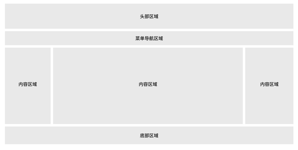
头部区域
.header {
  background-color: #F1F1F1;
  text-align: center;
  padding: 20px;
}
菜单导航区域
/* 导航条 */
.topnav {
  overflow: hidden;
  background-color: #333;
}

/* 导航链接 */
.topnav a {
  float: left;
  display: block;
  color: #f2f2f2;
  text-align: center;
  padding: 14px 16px;
  text-decoration: none;
}

/* 链接 - 修改颜色 */
.topnav a:hover {
  background-color: #ddd;
  color: black;
}
<div class="topnav">
  <a href="#">链接</a>
  <a href="#">链接</a>
  <a href="#">链接</a>
</div>
内容区域
/* 创建三个相等的列 */
.column {
  float: left;
  width: 33.33%;
}

/* 列后清除浮动 */
.row:after {
  content: "";
  display: table;
  clear: both;
}

/* 响应式布局 - 小于 600 px 时改为上下布局 */
@media screen and (max-width: 600px) {
  .column {
    width: 100%;
  }
}
不相等的列
多个单词中间用.代替空格分隔
.column {
  float: left;
}

/* 左右侧栏的宽度 */
.column.side {
  width: 25%;
}

/* 中间列宽度 */
.column.middle {
  width: 50%;
}

/* 响应式布局 - 宽度小于600px时设置上下布局 */
@media screen and (max-width: 600px) {
  .column.side, .column.middle {
    width: 100%;
  }
}
底部区域
/* 底部样式 */
.footer {
background-color: #f1f1f1;
padding: 10px;
text-align: center;
}
响应式
<!DOCTYPE html>
<html>
<head>
<meta charset="utf-8">
<title>响应式界面</title>
<style>
* {
box-sizing: border-box;
}
body {
font-family: Arial;
padding: 10px;
background: #f1f1f1;
}
/* 头部标题 */
.header {
padding: 30px;
text-align: center;
background: white;
}
.header h1 {
font-size: 50px;
}
/* 导航条 */
.topnav {
overflow: hidden;
background-color: #333;
}
/* 导航条链接 */
.topnav a {
float: left;
display: block;
color: #f2f2f2;
text-align: center;
padding: 14px 16px;
text-decoration: none;
}
/* 链接颜色修改 */
.topnav a:hover {
background-color: #ddd;
color: black;
}
/* 创建两列 */
/* Left column */
.leftcolumn {
float: left;
width: 75%;
}
/* 右侧栏 */
.rightcolumn {
float: left;
width: 25%;
background-color: #f1f1f1;
padding-left: 20px;
}
/* 图像部分 */
.fakeimg {
background-color: #aaa;
width: 100%;
padding: 20px;
}
/* 文章卡片效果 */
.card {
background-color: white;
padding: 20px;
margin-top: 20px;
}
/* 列后面清除浮动 */
.row:after {
content: "";
display: table;
clear: both;
}
/* 底部 */
.footer {
padding: 20px;
text-align: center;
background: #ddd;
margin-top: 20px;
}
/* 响应式布局 - 屏幕尺寸小于 800px 时,两列布局改为上下布局 */
@media screen and (max-width: 800px) {
.leftcolumn,
.rightcolumn {
width: 100%;
padding: 0;
}
}
/* 响应式布局 -屏幕尺寸小于 400px 时,导航等布局改为上下布局 */
@media screen and (max-width: 400px) {
.topnav a {
float: none;
width: 100%;
}
}
</style>
</head>
<body>
<div class="header">
<h1>我的网页</h1>
<p>重置浏览器大小查看效果。</p>
</div>
<div class="topnav">
<a href="#">链接</a>
<a href="#">链接</a>
<a href="#">链接</a>
<a href="#" style="float:right">链接</a>
</div>
<div class="row">
<div class="leftcolumn">
<div class="card">
<h2>文章标题</h2>
<h5>2019 年 4 月 17日</h5>
<div class="fakeimg" style="height:200px;">图片</div>
<p>一些文本...</p>
<p>菜鸟教程 - 学的不仅是技术,更是梦想!菜鸟教程 - 学的不仅是技术,更是梦想!菜鸟教程 - 学的不仅是技术,更是梦想!菜鸟教程 - 学的不仅是技术,更是梦想!</p>
</div>
<div class="card">
<h2>文章标题</h2>
<h5>2019 年 4 月 17日</h5>
<div class="fakeimg" style="height:200px;">图片</div>
<p>一些文本...</p>
<p>菜鸟教程 - 学的不仅是技术,更是梦想!菜鸟教程 - 学的不仅是技术,更是梦想!菜鸟教程 - 学的不仅是技术,更是梦想!菜鸟教程 - 学的不仅是技术,更是梦想!</p>
</div>
</div>
<div class="rightcolumn">
<div class="card">
<h2>关于我</h2>
<div class="fakeimg" style="height:100px;">图片</div>
<p>关于我的一些信息..</p>
</div>
<div class="card">
<h3>热门文章</h3>
<div class="fakeimg">
<p>图片</p>
</div>
<div class="fakeimg">
<p>图片</p>
</div>
<div class="fakeimg">
<p>图片</p>
</div>
</div>
<div class="card">
<h3>关注我</h3>
<p>一些文本...</p>
</div>
</div>
</div>
<div class="footer">
<h2>底部区域</h2>
</div>
</body>
</html>
!important
CSS 中的 !important 规则用于增加样式的权重。!important 与优先级无关,但它与最终的结果直接相关,使用一个 !important 规则时,此声明将覆盖任何其他声明。
/*所有段落显示为红色*/
#myid {
background-color: blue;
}
.myclass {
background-color: gray;
}
p {
background-color: red !important;
}
- 一定要优先考虑使用样式规则的优先级来解决问题而不是
!important - 只有在需要覆盖全站或外部 CSS 的特定页面中使用
!important - 永远不要在你的插件中使用
!important - 永远不要在全站范围的 CSS 代码中使用
!important
CSS3
边框
圆角边框
border-radius: 1-4 length|% / 1-4 length|%;
每个半径的四个值的顺序是:左上角,右上角,右下角,左下角,省略一角则相对角相同
| 值 | 描述 |
|---|---|
| length | 定义弯道的形状。 |
| % | 使用%定义角落的形状。宽度与高度比值 , 100%为1/4圆 , 50%为半圆 |
#example1 {
border: 2px solid red;
border-radius: 25px;
}
#example2 {
border: 2px solid red;
border-radius: 50px 20px;
}
border-radius: 1em/5em;
/* 等价于: */
border-top-left-radius: 1em 5em;
border-top-right-radius: 1em 5em;
border-bottom-right-radius: 1em 5em;
border-bottom-left-radius: 1em 5em;
border-radius: 4px 3px 6px / 2px 4px;
/* 等价于: */
border-top-left-radius: 4px 2px;
border-top-right-radius: 3px 4px;
border-bottom-right-radius: 6px 2px;
border-bottom-left-radius: 3px 4px;
盒阴影
/*向 div 元素添加阴影*/
/*5px模糊*/
div
{
box-shadow: 10px 10px 5px #888888;
}
/*0px 5px阴影*/
div
{
width:300px;
height:100px;
background-color:yellow;
box-shadow: 10px 10px 0px 5px #888888;
}
box-shadow: h-shadow v-shadow blur spread color inset;
| 值 | 说明 |
|---|---|
| h-shadow | 必需的。水平阴影的位置。允许负值 |
| v-shadow | 必需的。垂直阴影的位置。允许负值 |
| blur | 可选。模糊距离 |
| spread | 可选。阴影的大小 |
| color | 可选。阴影的颜色 |
| inset | 可选。从外层的阴影(开始时)改变阴影内侧阴影 |
图像边框
#borderimg {
-webkit-border-image: url(border.png) 30 round; /* Safari 3.1-5 */
-o-border-image: url(border.png) 30 round; /* Opera 11-12.1 */
border-image: url(border.png) 30 round;
}
border-image: source slice width outset repeat|initial|inherit;
/*图像路径*/
border-image-source: none|image;
| 值 | 说明 |
|---|---|
| none | 没有图像被使用 |
| image | 边框使用图像的路径 |
/*边界偏移*/
border-image-slice: number|%|fill;
此属性指定顶部,右,底部,左边缘的图像向内偏移,分为九个区域:四个角,四边和中间。图像中间部分将被丢弃(完全透明的处理),除非填写关键字。符合省略原则
| 值 | 说明 |
|---|---|
| number | 数字表示图像的像素(位图图像)或向量的坐标(如果图像是矢量图像) |
| % | 百分比图像的大小是相对的:水平偏移图像的宽度,垂直偏移图像的高度 |
| fill | 保留图像的中间部分 |
/*图片边框宽度*/
div
{
border-image-source: url(border.png);
border-image-width: 30 30;
}
border-image-width: number|%|auto;
| 值 | 说明 |
|---|---|
| number | 表示相应的border-width 的倍数 |
| % | 边界图像区域的大小:横向偏移的宽度的面积,垂直偏移的高度的面积 |
| auto | 如果指定了,宽度是相应的image slice的内在宽度或高度 |
/*指定在边框外部绘制 border-image-area 的量*/
border-image-outset: length|number;
| 值 | 描述 |
|---|---|
| length | 设置边框图像与边框(border-image)的距离,默认为0。1为显示一半,>2则不显示 |
| number | 代表相应的 border-width 的倍数 |
/*图像边界是否应重复(repeated)、拉伸(stretched)或铺满(rounded)*/
div {
border-image-source: url(border.png);
border-image-repeat: repeat;
}
border-image-repeat: stretch|repeat|round|initial|inherit;
该规定如何延展和铺排边框图像的边缘和中间部分。因此可以规定两个值。如果省略第二个值,则采取与第一个值相同的值。
| 值 | 描述 |
|---|---|
| stretch | 默认值。拉伸图像来填充区域 |
| repeat | 平铺(repeated)图像来填充区域。 |
| round | 类似 repeat 值。如果无法完整平铺所有图像,则对图像进行缩放以适应区域。 |
| space | 类似 repeat 值。如果无法完整平铺所有图像,扩展空间会分布在图像周围 |
| initial | 将此属性设置为默认值。 |
| inherit | 从父元素中继承该属性。 |
背景
background-image
不同的背景图像和图像用逗号隔开,所有的图片中显示在最顶端的为第一张。可以给不同的图片设置多个不同的属性
#example1 {
background-image: url(img_flwr.gif), url(paper.gif);
background-position: right bottom, left top;
/*右下角或左上角显示*/
background-repeat: no-repeat, repeat;
/*第一张不重复,第二张重复*/
}
#example1 {
background: url(img_flwr.gif) right bottom no-repeat, url(paper.gif) left top repeat;
}
background-size
div
{
background:url(img_flwr.gif);
background-size:80px 60px;
background-repeat:no-repeat;
}
div
{
background:url(img_flwr.gif);
background-size:100% 100%;
background-repeat:no-repeat;
}
| 值 | 描述 |
|---|---|
| length | 设置背景图片高度和宽度。第一个值设置宽度,第二个值设置的高度。如果只给出一个值,第二个是设置为 auto(自动) |
| percentage | 将计算相对于背景定位区域的百分比。第一个值设置宽度,第二个值设置的高度。如果只给出一个值,第二个是设置为"auto(自动)" |
| cover | 此时会保持图像的纵横比并将图像缩放成将完全覆盖背景定位区域的最小大小。 |
| contain | 此时会保持图像的纵横比并将图像缩放成将适合背景定位区域的最大大小。 |
background-origin
background-origin 属性指定了背景图像的位置区域。content-box, padding-box,和 border-box区域内可以放置背景图像。

div
{
background:url(img_flwr.gif);
background-repeat:no-repeat;
background-size:100% 100%;
background-origin:content-box;
}
| 值 | 描述 |
|---|---|
| padding-box | 背景图像填充框的相对位置 |
| border-box | 背景图像边界框的相对位置 |
| content-box | 背景图像的相对位置的内容框 |
background-clip
/*指定绘图区的背景*/
div
{
background-color:yellow;
background-clip:content-box;
}
| 值 | 说明 |
|---|---|
| border-box | 默认值。背景绘制在边框方框内(剪切成边框方框)。 |
| padding-box | 背景绘制在衬距方框内(剪切成衬距方框)。 |
| content-box | 背景绘制在内容方框内(剪切成内容方框)。 |
multiple backgrounds
background-image:url1,url2,...,urlN;
background-repeat : repeat1,repeat2,...,repeatN;
backround-position : position1,position2,...,positionN;
background-size : size1,size2,...,sizeN;
background-attachment : attachment1,attachment2,...,attachmentN;
background-clip : clip1,clip2,...,clipN;
background-origin : origin1,origin2,...,originN;
background-color : color;
渐变
CSS3 渐变(gradients)可以在两个或多个指定的颜色之间显示平稳的过渡
线性渐变
向下/向上/向左/向右/对角方向
background-image: linear-gradient(direction, color-stop1, color-stop2, ...);
渐变方向
/*从上到下渐变*/
#grad {
background-image: linear-gradient(#e66465, #9198e5);
}
/*从左到右渐变*/
#grad {
height: 200px;
background-image: linear-gradient(to right, red , yellow);
}
/*左上角到右下角渐变*/
#grad {
height: 200px;
background-image: linear-gradient(to bottom right, red, yellow);
}
带角度的线性渐变

/*带角度的线性渐变*/
background-image: linear-gradient(angle, color-stop1, color-stop2);
#grad {
background-image: linear-gradient(-90deg, red, yellow);
}
多颜色渐变
/*多颜色渐变*/
#grad {
background-image: linear-gradient(to right, red,orange,yellow,green,blue,indigo,violet);
}
透明度
可用于创建减弱变淡的效果 , 使用 rgba() 函数来定义颜色节点。rgba() 函数中的最后一个参数可以是从 0 到 1 的值,它定义了颜色的透明度:0 表示完全透明,1 表示完全不透明。
/*从左到右的线性渐变,带有透明度:*/
#grad {
background-image: linear-gradient(to right, rgba(255,0,0,0), rgba(255,0,0,1));
}
不均匀渐变
10% 表示 red 的颜色中心线在线性渐变方向的 10% 的位置。85% 表示 green 的颜色中心线在线性渐变方向的 85% 的位置。百分比表示指定颜色的标准中心线位置
/*一个重复的线性渐变*/
#grad {
background-image: repeating-linear-gradient(red, yellow 10%, green 20%);
}
径向渐变
由它们的中心定义,必须至少定义两种颜色节点。
background-image: radial-gradient(shape size at position, start-color, ..., last-color);
颜色分布
/*均匀分布*/
#grad {
background-image: radial-gradient(red, yellow, green);
}
/*不均匀分布*/
#grad {
background-image: radial-gradient(red 5%, yellow 15%, green 60%);
}
设置形状
shape 参数定义了形状。它可以是值 circle 或 ellipse , circle 表示圆形,ellipse 表示椭圆形。
#grad {
background-image: radial-gradient(circle, red, yellow, green);
}
渐变大小
size 参数定义了渐变的大小:
- closest-side
- farthest-side
- closest-corner
- farthest-corner
#grad1 {
background-image: radial-gradient(closest-side at 60% 55%, red, yellow, black);
}
#grad2 {
background-image: radial-gradient(farthest-side at 60% 55%, red, yellow, black);
}
重复渐变
#grad {
background-image: repeating-radial-gradient(red, yellow 10%, green 15%);
}
文字效果
文本阴影
水平阴影,垂直阴影,模糊距离,阴影颜色
h1
{
text-shadow: 5px 5px 5px #FF0000;
}
盒子阴影
div {
box-shadow: 10px 10px 5px #888888;
}
/*::before 和 ::after 两个伪元素中添加阴影效果*/
#boxshadow {
position: relative;
b ox-shadow: 1px 2px 4px rgba(0, 0, 0, .5);
pa dding: 10px;
bac kground: white;
}
#boxshadow img {
width: 100%;
border: 1px solid #8a4419;
border-style: inset;
}
#boxshadow::after {
content: '';
position: absolute;
z-index: -1; /* hide shadow behind image */
box-shadow: 0 15px 20px rgba(0, 0, 0, 0.3);
width: 70%;
left: 15%; /* one half of the remaining 30% */
height: 100px;
bottom: 0;
}
卡片效果
div.card {
width: 250px;
box-shadow: 0 4px 8px 0 rgba(0, 0, 0, 0.2), 0 6px 20px 0 rgba(0, 0, 0, 0.19);
text-align: center;
}
文本溢出
| 值 | 描述 |
|---|---|
| clip | 剪切文本。 |
| ellipsis | 显示省略符号 … 来代表被修剪的文本。 |
| string | 使用给定的字符串来代表被修剪的文本。 |
| initial | 设置为属性默认值 |
| inherit | 从父元素继承该属性值。 |
p.test1 {
white-space: nowrap;
width: 200px;
border: 1px solid #000000;
overflow: hidden;
text-overflow: clip;
}
p.test2 {
white-space: nowrap;
width: 200px;
border: 1px solid #000000;
overflow: hidden;
text-overflow: ellipsis;
}
强制换行
长单词和URL强制裂开换行
| 值 | 描述 |
|---|---|
| normal | 只在允许的断字点换行(浏览器保持默认处理)。 |
| break-word | 在长单词或 URL 地址内部进行换行。 |
p {word-wrap:break-word;}
单词拆分换行
| 值 | 描述 |
|---|---|
| normal | 使用浏览器默认的换行规则。 |
| break-all | 允许在单词内换行。 |
| keep-all | 只能在半角空格或连字符处换行。 |
p.test1 {
word-break: keep-all;
}
p.test2 {
word-break: break-all;
}
字体
CSS3网页设计师可以使用喜欢的任何字体 , 只需简单的将字体文件包含在网站中,它会自动下载给需要的用户 , 在 CSS3 @font-face 规则中定义
<style>
@font-face
{
font-family: myFirstFont;
src: url(sansation_light.woff);
}
div
{
font-family:myFirstFont;
}
</style>
/*粗体文本*/
@font-face
{
font-family: myFirstFont;
src: url(sansation_bold.woff);
font-weight:bold;
}
2D变换
translate() 方法
translate()方法,根据左(X轴)和顶部(Y轴)位置给定的参数,从当前元素位置移动
div
{
transform: translate(50px,100px);
-ms-transform: translate(50px,100px); /* IE 9 */
-webkit-transform: translate(50px,100px); /* Safari and Chrome */
}
rotate() 方法
rotate()方法,在一个给定度数顺时针旋转的元素。负值是允许的,这样是元素逆时针旋转。
div
{
transform: rotate(30deg);
-ms-transform: rotate(30deg); /* IE 9 */
-webkit-transform: rotate(30deg); /* Safari and Chrome */
}
scale() 方法
scale()方法,该元素增加或减少的大小,取决于宽度(X轴)和高度(Y轴)的参数
-ms-transform:scale(2,3); /* IE 9 */
-webkit-transform: scale(2,3); /* Safari */
transform: scale(2,3); /* 标准语法 */
skew() 方法
包含两个参数值,分别表示X轴和Y轴倾斜的角度,如果第二个参数为空,则默认为0,参数为负表示向相反方向倾斜。
- skewX(
<angle>);表示只在X轴(水平方向)倾斜。 - skewY(
<angle>);表示只在Y轴(垂直方向)倾斜。
div
{
transform: skew(30deg,20deg);
-ms-transform: skew(30deg,20deg); /* IE 9 */
-webkit-transform: skew(30deg,20deg); /* Safari and Chrome */
}
matrix() 方法
matrix 方法有六个参数,包含旋转,缩放,移动(平移)和倾斜功能
/*利用matrix()方法旋转div元素30°*/
div
{
transform:matrix(0.866,0.5,-0.5,0.866,0,0);
-ms-transform:matrix(0.866,0.5,-0.5,0.866,0,0); /* IE 9 */
-webkit-transform:matrix(0.866,0.5,-0.5,0.866,0,0); /* Safari and Chrome */
}
| 函数 | 描述 |
|---|---|
| matrix(n,n,n,n,n,n) | 定义 2D 转换,使用六个值的矩阵。 |
| translate(x,y) | 定义 2D 转换,沿着 X 和 Y 轴移动元素。 |
| translateX(n) | 定义 2D 转换,沿着 X 轴移动元素。 |
| translateY(n) | 定义 2D 转换,沿着 Y 轴移动元素。 |
| scale(x,y) | 定义 2D 缩放转换,改变元素的宽度和高度。 |
| scaleX(n) | 定义 2D 缩放转换,改变元素的宽度。 |
| scaleY(n) | 定义 2D 缩放转换,改变元素的高度。 |
| rotate(angle) | 定义 2D 旋转,在参数中规定角度。 |
| skew(x-angle,y-angle) | 定义 2D 倾斜转换,沿着 X 和 Y 轴。 |
| skewX(angle) | 定义 2D 倾斜转换,沿着 X 轴。 |
| skewY(angle) | 定义 2D 倾斜转换,沿着 Y 轴。 |
3D变换
| 函数 | 描述 |
|---|---|
| matrix3d(n,n,n,n,n,n, n,n,n,n,n,n,n,n,n,n) | 定义 3D 转换,使用 16 个值的 4x4 矩阵。 |
| translate3d(x,y,z) | 定义 3D 转化。 |
| translateX(x) | 定义 3D 转化,仅使用用于 X 轴的值。 |
| translateY(y) | 定义 3D 转化,仅使用用于 Y 轴的值。 |
| translateZ(z) | 定义 3D 转化,仅使用用于 Z 轴的值。 |
| scale3d(x,y,z) | 定义 3D 缩放转换。 |
| scaleX(x) | 定义 3D 缩放转换,通过给定一个 X 轴的值。 |
| scaleY(y) | 定义 3D 缩放转换,通过给定一个 Y 轴的值。 |
| scaleZ(z) | 定义 3D 缩放转换,通过给定一个 Z 轴的值。 |
| rotate3d(x,y,z,angle) | 定义 3D 旋转。 |
| rotateX(angle) | 定义沿 X 轴的 3D 旋转。 |
| rotateY(angle) | 定义沿 Y 轴的 3D 旋转。 |
| rotateZ(angle) | 定义沿 Z 轴的 3D 旋转。 |
| perspective(n) | 定义 3D 转换元素的透视视图。 |
transform-origin
transform-Origin属性允许您更改转换元素的位置。
2D转换元素可以改变元素的X和Y轴。 3D转换元素,还可以更改元素的Z轴。
| x-axis | 定义视图被置于 X 轴的何处。可能的值:left center right length % |
|---|---|
| y-axis | 定义视图被置于 Y 轴的何处。可能的值:top center bottom length % |
| z-axis | 定义视图被置于 Z 轴的何处。可能的值:length |
transform-style
transform–style属性指定嵌套元素是怎样在三维空间中呈现
| 值 | 描述 |
|---|---|
| flat | 表示所有子元素在2D平面呈现。 |
| preserve-3d | 表示所有子元素在3D空间中呈现。 |
/*让转换的子元素保留3D转换*/
div
{
transform: rotateY(60deg);
transform-style: preserve-3d;
-webkit-transform: rotateY(60deg); /* Safari and Chrome */
-webkit-transform-style: preserve-3d; /* Safari and Chrome */
}
perspective
多少像素的3D元素是从视图的perspective属性定义。这个属性允许你改变3D元素是怎样查看透视图。
定义时的perspective属性,它是一个元素的子元素,透视图,而不是元素本身。
| 值 | 描述 |
|---|---|
| number | 元素距离视图的距离,以像素计。 |
| none | 默认值。与 0 相同。不设置透视。 |
perspective-origin
perspective-origin 属性定义 3D 元素所基于的 X 轴和 Y 轴。该属性允许您改变 3D 元素的底部位置。定义时的perspective -Origin属性,它是一个元素的子元素,透视图,而不是元素本身。
| 值 | 描述 |
|---|---|
| x-axis | 定义该视图在 x 轴上的位置。默认值:50%。可能的值:left center right length % |
| y-axis | 定义该视图在 y 轴上的位置。默认值:50%。可能的值:top center bottom length % |
div
{
perspective:150;
perspective-origin: 10% 10%;
-webkit-perspective:150; /* Safari and Chrome */
-webkit-perspective-origin: 10% 10%; /* Safari and Chrome */
}
backface-visibility
backface-visibility 属性定义当元素背面向屏幕时是否可见。
/*隐藏旋转 div 元素的背面*/
div
{
backface-visibility:hidden;
-webkit-backface-visibility:hidden; /* Chrome 、Safari */
-moz-backface-visibility:hidden; /* Firefox */
-ms-backface-visibility:hidden; /* Internet Explorer */
}
| 值 | 描述 |
|---|---|
| visible | 背面是可见的。 |
| hidden | 背面是不可见的。 |
过渡
transition默认值是0
/*宽度属性过渡*/
div
{
width:100px;
height:100px;
background:red;
transition:width 2s;
-webkit-transition:width 2s; /* Safari */
}
div:hover
{
width:300px;
}
/*多项改变
添加了宽度,高度和转换效果*/
div
{
transition: width 2s, height 2s, transform 2s;
-webkit-transition: width 2s, height 2s, -webkit-transform 2s;
}
/*简写属性*/
transition: property duration timing-function delay;
transition-property
div
{
transition-property:width;
-moz-transition-property: width; /* Firefox 4 */
-webkit-transition-property:width; /* Safari and Chrome */
-o-transition-property:width; /* Opera */
}
div:hover {width:300px;}
| 值 | 描述 |
|---|---|
| none | 没有属性会获得过渡效果。 |
| all | 所有属性都将获得过渡效果。 |
| property | 定义应用过渡效果的 CSS 属性名称列表,列表以逗号分隔。 |
transition-duration
规定完成过渡效果需要花费的时间(以秒或毫秒计)。 默认值是 0,意味着不会有效果。
transition-duration: time;
transition-timing-function
transition-timing-function属性指定切换效果的速度
transition-timing-function: linear|ease|ease-in|ease-out|ease-in-out|cubic-bezier(n,n,n,n);
| 值 | 描述 |
|---|---|
| linear | 规定以相同速度开始至结束的过渡效果(等于 cubic-bezier(0,0,1,1))。 |
| ease | 规定慢速开始,然后变快,然后慢速结束的过渡效果(cubic-bezier(0.25,0.1,0.25,1))。 |
| ease-in | 规定以慢速开始的过渡效果(等于 cubic-bezier(0.42,0,1,1))。 |
| ease-out | 规定以慢速结束的过渡效果(等于 cubic-bezier(0,0,0.58,1))。 |
| ease-in-out | 规定以慢速开始和结束的过渡效果(等于 cubic-bezier(0.42,0,0.58,1))。 |
| cubic-bezier(n,n,n,n) | 在 cubic-bezier 函数中定义自己的值。可能的值是 0 至 1 之间的数值。 |
transition-delay
指定何时将开始切换效果。以秒为单位(S)或毫秒(ms)
transition-delay: time;
动画
@keyframes 规则内指定一个 CSS 样式和动画将逐步从目前的样式更改为新的样式
@keyframes myfirst
{
from {background: red;}
to {background: yellow;}
}
@-webkit-keyframes myfirst /* Safari 与 Chrome */
{
from {background: red;}
to {background: yellow;}
}
当在 @keyframes 创建动画,把它绑定到一个选择器,否则动画不会有任何效果。指定至少这两个CSS3的动画属性绑定向一个选择器:
- 规定动画的名称
- 规定动画的时长
div
{
animation: myfirst 5s;
-webkit-animation: myfirst 5s; /* Safari 与 Chrome */
}
用百分比来规定变化发生的时间,或用关键词 “from” 和 “to”,等同于 0% 和 100%。0% 是动画的开始,100% 是动画的完成。
@keyframes myfirst
{
0% {background: red; left:0px; top:0px;}
25% {background: yellow; left:200px; top:0px;}
50% {background: blue; left:200px; top:200px;}
75% {background: green; left:0px; top:200px;}
100% {background: red; left:0px; top:0px;}
}
@-webkit-keyframes myfirst /* Safari 与 Chrome */
{
0% {background: red; left:0px; top:0px;}
25% {background: yellow; left:200px; top:0px;}
50% {background: blue; left:200px; top:200px;}
75% {background: green; left:0px; top:200px;}
100% {background: red; left:0px; top:0px;}
}
| 属性 | 描述 |
|---|---|
| @keyframes | 规定动画。 |
| animation | 所有动画属性的简写属性。 |
| animation-name | 规定 @keyframes 动画的名称。 |
| animation-duration | 规定动画完成一个周期所花费的秒或毫秒。默认是 0。 |
| animation-timing-function | 规定动画的速度曲线。默认是 “ease”。 |
| animation-fill-mode | 规定当动画不播放时(当动画完成时,或当动画有一个延迟未开始播放时),要应用到元素的样式。 |
| animation-delay | 规定动画何时开始。默认是 0。 |
| animation-iteration-count | 规定动画被播放的次数。默认是 1。 |
| animation-direction | 规定动画是否在下一周期逆向地播放。默认是 “normal”。 |
| animation-play-state | 规定动画是否正在运行或暂停。默认是 “running”。 |
div
{
animation-name: myfirst;
animation-duration: 5s;
animation-timing-function: linear;
animation-delay: 2s;
animation-iteration-count: infinite;
animation-direction: alternate;
animation-play-state: running;
/* Safari 与 Chrome: */
-webkit-animation-name: myfirst;
-webkit-animation-duration: 5s;
-webkit-animation-timing-function: linear;
-webkit-animation-delay: 2s;
-webkit-animation-iteration-count: infinite;
-webkit-animation-direction: alternate;
-webkit-animation-play-state: running;
}
多列
创建多列
column-count属性指定了需要分割的列数 , 分列宽度优先,优先给每个列最大宽度分满
| 值 | 说明 |
|---|---|
| number | 列的最佳数目将其中的元素的内容无法流出 |
| auto | 列数将取决于其他属性,例如:“column-width” |
div {
-webkit-column-count: 3; /* Chrome, Safari, Opera */
-moz-column-count: 3; /* Firefox */
column-count: 3;
}
列间间隙
column-gap 属性指定了列与列间的间隙
| 值 | 描述 |
|---|---|
| length | 一个指定的长度,将设置列之间的差距 |
| normal | 指定一个列之间的普通差距。 W3C建议1EM值 |
div {
-webkit-column-gap: 40px; /* Chrome, Safari, Opera */
-moz-column-gap: 40px; /* Firefox */
column-gap: 40px;
}
列边框
column-rule-style 属性指定了列与列间的边框样式
| 值 | 描述 |
|---|---|
| none | 定义没有规则。 |
| hidden | 定义隐藏规则。 |
| dotted | 定义点状规则。 |
| dashed | 定义虚线规则。 |
| solid | 定义实线规则。 |
| double | 定义双线规则。 |
| groove | 定义 3D grooved 规则。该效果取决于宽度和颜色值。 |
| ridge | 定义 3D ridged 规则。该效果取决于宽度和颜色值。 |
| inset | 定义 3D inset 规则。该效果取决于宽度和颜色值。 |
| outset | 定义 3D outset 规则。该效果取决于宽度和颜色值 |
div {
-webkit-column-rule-style: solid; /* Chrome, Safari, Opera */
-moz-column-rule-style: solid; /* Firefox */
column-rule-style: solid;
}
column-rule-width 属性指定了两列的边框厚度
| 值 | 说明 |
|---|---|
| thin | 指定一个细边框的规则 |
| medium | 定义一个中等边框规则 |
| thick | 指定一个粗边框的规则 |
| length | 指定宽度的规则 |
div {
-webkit-column-rule-width: 1px; /* Chrome, Safari, Opera */
-moz-column-rule-width: 1px; /* Firefox */
column-rule-width: 1px;
}
column-rule-color 属性指定了两列的边框颜色
div {
-webkit-column-rule-color: lightblue; /* Chrome, Safari, Opera */
-moz-column-rule-color: lightblue; /* Firefox */
column-rule-color: lightblue;
}
column-rule 属性是 column-rule-* 所有属性的简写。
div {
-webkit-column-rule: 1px solid lightblue; /* Chrome, Safari, Opera */
-moz-column-rule: 1px solid lightblue; /* Firefox */
column-rule: 1px solid lightblue;
}
跨越的列
column-span属性指定某个元素应该跨越多少列
| 值 | 描述 |
|---|---|
| 1 | 元素应跨越一列 |
| all | 该元素应该跨越所有列 |
h2 {
-webkit-column-span: all; /* Chrome, Safari, Opera */
column-span: all;
}
列的宽度
column-width 属性指定了列的宽度,即可容纳多少字符
| 值 | 描述 |
|---|---|
| auto | 浏览器将决定列的宽度 |
| length | 指定列宽的长度 |
div {
-webkit-column-width: 100px; /* Chrome, Safari, Opera */
column-width: 100px;
}
简写属性
columns: column-width column-count;
用户界面
box-sizing
| 值 | 说明 |
|---|---|
| content-box | 默认值。如果你设置一个元素内容的宽为 100px,那么这个元素的内容区会有 100px 宽,并且任何边框和内边距的宽度都会被增加到最后绘制出来的元素宽度中。 |
| border-box | 告诉浏览器:你想要设置的边框和内边距的值是包含在 width 内的。包含它的 border 和 padding,内容区的实际宽度是 width 减 去(border + padding) 的值。大多数情况下,这使得我们更容易地设定一个元素的宽高。 **注:**border-box 不包含 margin。 |
| inherit | 指定 box-sizing 属性的值,应该从父元素继承 |
/*设置通用box-sizing*/
* {
box-sizing: border-box;
}
outline-offset
outline-offset属性设置轮廓框架在 border 边缘外的偏移
Outlines在两个方面不同于边框:
- Outlines 不占用空间
- Outlines 可能非矩形
outline-offset: length|inherit:
| 值 | 描述 |
|---|---|
| length | 轮廓与边框边缘的距离。 |
| inherit | 规定应从父元素继承 outline-offset 属性的值。 |
/*指定外边框边缘的轮廓15px*/
div
{
border:2px solid black;
outline:2px solid red;
outline-offset:15px;
}
resize
resize属性指定一个元素是否是由用户调整大小的
| 值 | 描述 |
|---|---|
| none | 用户无法调整元素的尺寸。 |
| both | 用户可调整元素的高度和宽度。 |
| horizontal | 用户可调整元素的宽度。 |
| vertical | 用户可调整元素的高度。 |
çdiv
{
resize:both;
overflow:auto;
}
图片
圆角图片
/*圆角图片*/
img {
border-radius: 8px;
}
/*椭圆图片*/
img {
border-radius: 50%;
}
缩略图
a {
display: inline-block;
border: 1px solid #ddd;
border-radius: 4px;
padding: 5px;
transition: 0.3s;
}
a:hover {
box-shadow: 0 0 2px 1px rgba
(0, 140, 186, 0.5);
}
<a href="paris.jpg">
<img src="paris.jpg" alt="Paris">
</a>
响应式图片
自由缩放图片时,图片放大的尺寸不大于原始的最大值
img {
max-width: 100%;
height: auto;
}
图片文本
借助绝对定位,相对定位
.container {
position: relative;
}
.topleft {
position: absolute;
top: 8px;
left: 16px;
font-size: 18px;
}
img {
width: 100%;
height: auto;
opacity: 0.3;
}
.center {
position: absolute;
left: 0;
top: 50%;
width: 100%;
text-align: center;
font-size: 18px;
margin-top:-9px;
}
卡片式图片
body {margin:25px;}
div.polaroid {
width: 80%;
background-color: white;
box-shadow: 0 4px 8px 0 rgba(0, 0, 0, 0.2), 0 6px 20px 0 rgba(0, 0, 0, 0.19);
margin-bottom: 25px;
}
div.container {
text-align: center;
padding: 10px 20px;
}
<div class="polaroid">
<img src="rock600x400.jpg" alt="Norway" style="width:100%">
<div class="container">
<p>The Troll's tongue in Hardanger, Norway</p>
</div>
</div>
<div class="polaroid">
<img src="lights600x400.jpg" alt="Norway" style="width:100%">
<div class="container">
<p>Northern Lights in Norway</p>
</div>
</div>
图片滤镜
img {
-webkit-filter: grayscale(100%); /* Chrome, Safari, Opera */
filter: grayscale(100%);
}
| Filter | 描述 |
|---|---|
| none | 默认值,没有效果。 |
| blur(px) | 给图像设置高斯模糊。"radius"一值设定高斯函数的标准差,或者是屏幕上以多少像素融在一起, 所以值越大越模糊; 如果没有设定值,则默认是0;这个参数可设置css长度值,但不接受百分比值。 |
| brightness(%) | 给图片应用一种线性乘法,使其看起来更亮或更暗。如果值是0%,图像会全黑。值是100%,则图像无变化。其他的值对应线性乘数效果。值超过100%也是可以的,图像会比原来更亮。如果没有设定值,默认是1。 |
| contrast(%) | 调整图像的对比度。值是0%的话,图像会全黑。值是100%,图像不变。值可以超过100%,意味着会运用更低的对比。若没有设置值,默认是1。 |
| drop-shadow(h-shadow v-shadow blur spread color) | 给图像设置一个阴影效果。阴影是合成在图像下面,可以有模糊度的,可以以特定颜色画出的遮罩图的偏移版本。 函数接受<shadow>参数如下:``**<offset-x>** **<offset-y>** (必须)这是设置阴影偏移量的两个 <length>值. **<offset-x>** 设定水平方向距离. 负值会使阴影出现在元素左边. **<offset-y>**设定垂直距离.负值会使阴影出现在元素上方。查看**<length>**可能的单位.**如果两个值都是0**, 则阴影出现在元素正后面 (如果设置了 <blur-radius> and/or <spread-radius>,会有模糊效果).**<blur-radius>** (可选)这是第三个code><length>值. 值越大,越模糊,则阴影会变得更大更淡.不允许负值 若未设定,默认是0 (则阴影的边界很锐利).**<spread-radius>** (可选)这是第四个 <length>值. 正值会使阴影扩张和变大,负值会是阴影缩小.若未设定,默认是0 (阴影会与元素一样大小). 注意: Webkit, 以及一些其他浏览器 不支持第四个长度,如果加了也不会渲染。 **<color>** (可选)查看 <color>该值可能的关键字和标记。若未设定,颜色值基于浏览器。在Gecko (Firefox), Presto (Opera)和Trident (Internet Explorer)中, 会应用color**color**属性的值。另外, 如果颜色值省略,WebKit中阴影是透明的。
|
| grayscale(%) | 将图像转换为灰度图像。值定义转换的比例。值为100%则完全转为灰度图像,值为0%图像无变化。值在0%到100%之间,则是效果的线性乘子。若未设置,值默认是0; |
| hue-rotate(deg) | 给图像应用色相旋转。"angle"一值设定图像会被调整的色环角度值。值为0deg,则图像无变化。若值未设置,默认值是0deg。该值虽然没有最大值,超过360deg的值相当于又绕一圈。 |
| invert(%) | 反转输入图像。值定义转换的比例。100%的价值是完全反转。值为0%则图像无变化。值在0%和100%之间,则是效果的线性乘子。 若值未设置,值默认是0。 |
| opacity(%) | 转化图像的透明程度。值定义转换的比例。值为0%则是完全透明,值为100%则图像无变化。值在0%和100%之间,则是效果的线性乘子,也相当于图像样本乘以数量。 若值未设置,值默认是1。该函数与已有的opacity属性很相似,不同之处在于通过filter,一些浏览器为了提升性能会提供硬件加速。 |
| saturate(%) | 转换图像饱和度。值定义转换的比例。值为0%则是完全不饱和,值为100%则图像无变化。其他值,则是效果的线性乘子。超过100%的值是允许的,则有更高的饱和度。 若值未设置,值默认是1。 |
| sepia(%) | 将图像转换为深褐色。值定义转换的比例。值为100%则完全是深褐色的,值为0%图像无变化。值在0%到100%之间,则是效果的线性乘子。若未设置,值默认是0; |
| url() | URL函数接受一个XML文件,该文件设置了 一个SVG滤镜,且可以包含一个锚点来指定一个具体的滤镜元素。例如:filter: url(svg-url#element-id) |
| initial | 设置属性为默认值 |
| inherit | 从父元素继承该属性 |
按钮
.button {
background-color: #4CAF50; /* Green */
border: none;
color: white;
padding: 15px 32px;
text-align: center;
text-decoration: none;
display: inline-block;
font-size: 16px;
}
/*圆角边框*/
.button1 {border-radius: 2px;}
/*边框颜色*/
.button1 {
background-color: white;
color: black;
border: 2px solid #4CAF50; /* Green */
}
/*按钮阴影*/
.button2:hover {
box-shadow: 0 12px 16px 0 rgba(0,0,0,0.24), 0 17px 50px 0 rgba(0,0,0,0.19);
}
/*禁用按钮*/
.disabled {
opacity: 0.6;
cursor: not-allowed;
}
/*按钮宽度*/
.button1 {width: 250px;}
/*按钮组 移除外边距并添加 float:left 来设置按钮组*/
.button {
float: left;
}
/*按钮动画*/
.button {
display: inline-block;
padding: 15px 25px;
font-size: 24px;
cursor: pointer;
text-align: center;
text-decoration: none;
outline: none;
color: #fff;
background-color: #4CAF50;
border: none;
border-radius: 15px;
box-shadow: 0 9px #999;
}
.button:hover {background-color: #3e8e41}
.button:active {
background-color: #3e8e41;
box-shadow: 0 5px #666;
transform: translateY(4px);
}
分页
网站有多个页面,需要使用分页来为每个页面做导航
ul.pagination {
display: inline-block;
padding: 0;
margin: 0;
}
ul.pagination li {display: inline;}
ul.pagination li a {
color: black;
float: left;
padding: 8px 16px;
text-decoration: none;
}
ul.pagination li a.active {
background-color: #4CAF50;
color: white;
}
ul.pagination li a:hover:not(.active) {background-color: #ddd;}
/*圆角*/
ul.pagination li a {
border-radius: 5px;
}
/*过渡效果*/
ul.pagination li a {
transition: background-color .3s;
}
/*边框分页*/
ul.pagination li a {
border: 1px solid #ddd; /* Gray */
}
/*分页间隔*/
ul.pagination li a {
margin: 0 4px; /* 0 对应的是头部与底部,可以修改它看看效果 */
}
弹性盒子
CSS3 弹性盒( Flexible Box 或 flexbox),是一种当页面需要适应不同的屏幕大小以及设备类型时确保元素拥有恰当的行为的布局方式。引入弹性盒布局模型的目的是提供一种更加有效的方式来对一个容器中的子元素进行排列、对齐和分配空白空间。弹性子元素通常在弹性盒子内一行显示。默认情况每个容器只有一行。
.flex-container {
display: -webkit-flex;
display: flex;
width: 400px;
height: 250px;
background-color: lightgrey;
}
.flex-item {
background-color: cornflowerblue;
width: 100px;
height: 100px;
margin: 10px;
}
/*反向显示弹性子元素顺序*/
body {
direction: rtl;
}
flex-direction
flex-direction 属性指定了弹性子元素在父容器中的位置
flex-direction: row | row-reverse | column | column-reverse
- row:横向从左到右排列(左对齐),默认的排列方式
- row-reverse:反转横向排列(右对齐,从后往前排,最后一项排在最前面
- column:纵向排列
- column-reverse:反转纵向排列,从后往前排,最后一项排在最上面
.flex-container {
display: -webkit-flex;
display: flex;
-webkit-flex-direction: row-reverse;
flex-direction: row-reverse;
width: 400px;
height: 250px;
background-color: lightgrey;
}
justify-content
内容对齐(justify-content)属性应用在弹性容器上,把弹性项沿着弹性容器的主轴线(main axis)对齐。
justify-content: flex-start | flex-end | center | space-between | space-around
flex-start:
弹性项目向行头紧挨着填充。这个是默认值。第一个弹性项的main-start外边距边线被放置在该行的main-start边线,而后续弹性项依次平齐摆放。
flex-end:
弹性项目向行尾紧挨着填充。第一个弹性项的main-end外边距边线被放置在该行的main-end边线,而后续弹性项依次平齐摆放。
center:
弹性项目居中紧挨着填充。(如果剩余的自由空间是负的,则弹性项目将在两个方向上同时溢出)。
space-between:
弹性项目平均分布在该行上。如果剩余空间为负或者只有一个弹性项,则该值等同于flex-start。否则,第1个弹性项的外边距和行的main-start边线对齐,而最后1个弹性项的外边距和行的main-end边线对齐,然后剩余的弹性项分布在该行上,相邻项目的间隔相等。
space-around:
弹性项目平均分布在该行上,两边留有一半的间隔空间。如果剩余空间为负或者只有一个弹性项,则该值等同于center。否则,弹性项目沿该行分布,且彼此间隔相等(比如是20px),同时首尾两边和弹性容器之间留有一半的间隔(1/2*20px=10px)。
.flex-container {
display: -webkit-flex;
display: flex;
-webkit-justify-content: space-around;
justify-content: space-around;
width: 400px;
height: 250px;
background-color: lightgrey;
}
align-items
align-items 设置或检索弹性盒子元素在侧轴(纵轴)方向上的对齐方式
align-items: flex-start | flex-end | center | baseline | stretch
- flex-start:弹性盒子元素的侧轴(纵轴)起始位置的边界紧靠住该行的侧轴起始边界。
- flex-end:弹性盒子元素的侧轴(纵轴)起始位置的边界紧靠住该行的侧轴结束边界。
- center:弹性盒子元素在该行的侧轴(纵轴)上居中放置。(如果该行的尺寸小于弹性盒子元素的尺寸,则会向两个方向溢出相同的长度)。
- baseline:如弹性盒子元素的行内轴与侧轴为同一条,则该值与
flex-start等效。其它情况下,该值将参与基线对齐。 - stretch:如果指定侧轴大小的属性值为’auto’,则其值会使项目的边距盒的尺寸尽可能接近所在行的尺寸,但同时会遵照’min/max-width/height’属性的限制。
flex-wrap
flex-wrap 属性用于指定弹性盒子的子元素换行方式
flex-wrap: nowrap|wrap|wrap-reverse|initial|inherit;
- nowrap - 默认, 弹性容器为单行。该情况下弹性子项可能会溢出容器。
- wrap - 弹性容器为多行。该情况下弹性子项溢出的部分会被放置到新行,子项内部会发生断行
- wrap-reverse -反转 wrap 排列。
.flex-container {
display: -webkit-flex;
display: flex;
-webkit-flex-wrap: wrap-reverse;
flex-wrap: wrap-reverse;
width: 300px;
height: 250px;
background-color: lightgrey;
}
align-content
align-content 属性用于修改 flex-wrap 属性的行为。类似于 align-items, 但它不是设置弹性子元素的对齐,而是设置各个行的对齐。
align-content: flex-start | flex-end | center | space-between | space-around | stretch
stretch- 默认。各行将会伸展以占用剩余的空间。flex-start- 各行向弹性盒容器的起始位置堆叠。flex-end- 各行向弹性盒容器的结束位置堆叠。center-各行向弹性盒容器的中间位置堆叠。space-between-各行在弹性盒容器中平均分布。space-around- 各行在弹性盒容器中平均分布,两端保留子元素与子元素之间间距大小的一半。
.flex-container {
display: -webkit-flex;
display: flex;
-webkit-flex-wrap: wrap;
flex-wrap: wrap;
-webkit-align-content: center;
align-content: center;
width: 300px;
height: 300px;
background-color: lightgrey;
}
弹性子元素属性
排序
数值小的排在前面。可以为负值
order:
.flex-item {
background-color: cornflowerblue;
width: 100px;
height: 100px;
margin: 10px;
}
.first {
-webkit-order: -1;
order: -1;
}
对齐
设置"margin"值为"auto"值,自动获取弹性容器中剩余的空间。所以设置垂直方向margin值为"auto",可以使弹性子元素在弹性容器的两上轴方向都完全居中。
/*将剩余的空间放置在元素的右侧*/
.flex-item {
background-color: cornflowerblue;
width: 75px;
height: 75px;
margin: 10px;
}
.flex-item:first-child {
margin-right: auto;
}
完美的居中
设置 margin: auto; 可以使得弹性子元素在两上轴方向上完全居中
.flex-item {
background-color: cornflowerblue;
width: 75px;
height: 75px;
margin: auto;
}
align-self
align-self 属性用于设置弹性元素自身在侧轴(纵轴)方向上的对齐方式。
align-self: auto | flex-start | flex-end | center | baseline | stretch
.item5 {
-webkit-align-self: stretch;
align-self: stretch;
}
- auto:如果’align-self’的值为’auto’,则其计算值为元素的父元素的’align-items’值,如果其没有父元素,则计算值为’stretch’。
- flex-start:弹性盒子元素的侧轴(纵轴)起始位置的边界紧靠住该行的侧轴起始边界。
- flex-end:弹性盒子元素的侧轴(纵轴)起始位置的边界紧靠住该行的侧轴结束边界。
- center:弹性盒子元素在该行的侧轴(纵轴)上居中放置。(如果该行的尺寸小于弹性盒子元素的尺寸,则会向两个方向溢出相同的长度)。
- baseline:如弹性盒子元素的行内轴与侧轴为同一条,则该值与’flex-start’等效。其它情况下,该值将参与基线对齐。
- stretch:如果指定侧轴大小的属性值为’auto’,则其值会使项目的边距盒的尺寸尽可能接近所在行的尺寸,但同时会遵照’min/max-width/height’属性的限制。
flex
flex 属性用于指定弹性子元素如何分配空间
flex: auto | initial | none | inherit | [ flex-grow ] || [ flex-shrink ] || [ flex-basis ]
- auto: 计算值为 1 1 auto
- initial: 计算值为 0 1 auto
- none:计算值为 0 0 auto
- inherit:从父元素继承
- [ flex-grow ]:定义弹性盒子元素的扩展比率。
- [ flex-shrink ]:定义弹性盒子元素的收缩比率。
- [ flex-basis ]:定义弹性盒子元素的默认基准值。
多媒体查询
CSS3 的多媒体查询取代了查找设备的类型,CSS3 根据设置自适应显示。
媒体查询可用于检测很多事情,例如:
- viewport(视窗) 的宽度与高度
- 设备的宽度与高度
- 朝向 (智能手机横屏,竖屏) 。
- 分辨率
@media not|only mediatype and (expressions) {
CSS 代码...;
}
- not: not是用来排除掉某些特定的设备的,比如 @media not print(非打印设备)。
- only: 用来定某种特别的媒体类型。对于支持Media Queries的移动设备来说,如果存在only关键字,移动设备的Web浏览器会忽略only关键字并直接根据后面的表达式应用样式文件。对于不支持Media Queries的设备但能够读取Media Type类型的Web浏览器,遇到only关键字时会忽略这个样式文件。
- all: 所有设备,这个应该经常看到。
| 值 | 描述 |
|---|---|
| all | 用于所有多媒体类型设备 |
| 用于打印机 | |
| screen | 用于电脑屏幕,平板,智能手机等。 |
| speech | 用于屏幕阅读器 |
@media screen and (max-width: 480px) {
body {
background-color: lightgreen;
}
}
@media screen and (max-width: 699px) and (min-width: 520px) {
ul li a {
padding-left: 30px;
background: url(email-icon.png) left center no-repeat;
}
}
网格布局
网格元素
网格布局由一个父元素及一个或多个子元素组成
<div class="grid-container">
<div class="grid-item">1</div>
<div class="grid-item">2</div>
<div class="grid-item">3</div>
<div class="grid-item">4</div>
<div class="grid-item">5</div>
<div class="grid-item">6</div>
<div class="grid-item">7</div>
<div class="grid-item">8</div>
<div class="grid-item">9</div>
</div>
display 属性
当一个 HTML 元素将 display 属性设置为 grid 或 inline-grid 后,它就变成了一个网格容器,这个元素的所有直系子元素将成为网格元素。
.grid-container {
display: grid;
}
.grid-container {
display: inline-grid;
}
网格轨道
我们通过 grid-template-columns 和 grid-template-rows 属性来定义网格中的行和列。这些属性定义了网格的轨道,一个网格轨道就是网格中任意两条线之间的空间。
/*创建四个列*/
.grid-container {
display: grid;
grid-template-columns: auto auto auto auto;
}
/*设置两行行的高度*/
.grid-container {
display: grid;
grid-template-rows: 100px 300px;
}
fr 单位
轨道可以使用任何长度单位进行定义。网格引入了 fr 单位来帮助创建灵活的网格轨道。一个 fr 单位代表网格容器中可用空间的一等份。
/*创建三个相等宽度的轨道*/
.grid-container {
display: grid;
grid-template-columns: 1fr 1fr 1fr;
}
网格单元
一个网格单元是在一个网格元素中最小的单位, 从概念上来讲其实它和表格的一个单元格很像。一旦一个网格元素被定义在一个父级元素当中,那么他的子级元素将会排列在每个事先定义好的网格单元中。
网格区域
网格元素可以向行或着列的方向扩展一个或多个单元,并且会创建一个网格区域。网格区域的形状应该是一个矩形 - 也就是说你不可能创建出一个类似于"L"形的网格区域。
网格间距
网格间距(Column Gap)指的是两个网格单元之间的网格横向间距或网格纵向间距。
- grid-column-gap
- grid-row-gap
- grid-gap
.grid-container {
display: grid;
grid-column-gap: 50px;
}
/*同时设置行和列*/
.grid-container {
display: grid;
grid-gap: 50px 100px;
}
.grid-container {
display: grid;
grid-gap: 50px;
}
网格区域
列与列,行与行之间的交接处就是网格线 , 含边框线
grid-column: grid-column-start / grid-column-end;
/*设置一个网格元素的网格线从第一列开始,第三列结束*/
.item1 {
grid-column-start: 1;
grid-column-end: 3;
}
/*设置一个网格元素的网格线从第一行开始,第三行结束*/
.item1 {
grid-row-start: 1;
grid-row-end: 3;
}
grid-area 属性指定网格元素在网格布局中的大小和位置
grid-area: grid-row-start / grid-column-start / grid-row-end / grid-column-end | itemname;
/*item1 命名为 "myArea", 并跨越五列*/
.item1 {
grid-area: myArea;
}
.grid-container {
grid-template-areas: 'myArea myArea myArea myArea myArea';
}
/*
每行由单引号内 ' ' 定义,以空格分隔。
. 号表示没有名称的网格项。
要定义两行,请在另一组单引号内 ' ' 定义第二行的列。
*/
.item1 {
grid-area: myArea;
}
.grid-container {
grid-template-areas: 'myArea myArea . . .';
}
/*设置 "item1" 跨越 2 行 2 列*/
.grid-container {
display: grid;
grid-template-areas: 'myArea myArea . . .' 'myArea myArea . . .';
grid-gap: 10px;
background-color: #2196F3;
padding: 10px;
}
/*网页模板*/
.item1 { grid-area: header; }
.item2 { grid-area: menu; }
.item3 { grid-area: main; }
.item4 { grid-area: right; }
.item5 { grid-area: footer; }
.grid-container {
grid-template-areas:
'header header header header header header'
'menu main main main right right'
'menu footer footer footer footer footer';
}

行列大小
/*设置网格中列的默认大小*/
.grid-container {
display: grid;
grid-auto-columns: 50px;
}
/*设置网格中行的默认大小*/
.grid-container {
display: grid;
grid-auto-rows: 150px;
}
| 值 | 描述 |
|---|---|
| auto | 默认值。 列的大小由容器的大小决定 |
| fit-content() | 相当于公式 min(max-content, max(auto, argument)),类似于auto 的计算(即 minmax(auto, max-content)) |
| max-content | 根据列中最大的网格元素设置每列的大小 |
| min-content | 根据列中的最小的网格元素设置每列的大小 |
| minmax(min.max) | 设置大于等于 min 且小于等于 max |
| length | 使用自定义的长度值设置列的大小。 |
| % | 使用百分比值设置列的大小 |
插入网格元素
/*逐列插入网格元素*/
.grid-container {
display: grid;
grid-auto-flow: column;
}
| 值 | 描述 |
|---|---|
| row | 默认值。 通过填充每一行来放置网格元素,在必要时增加新列。 |
| column | 通过填充每一列来放置网格元素,在必要时增加新列。 |
| dense | 该关键字指定自动布局算法使用一种"稠密"堆积算法,如果后面出现了稍小的元素,则会试图去填充网格中前面留下的空白。这样做会填上稍大元素留下的空白,但同时也可能导致原来出现的次序被打乱。 |
| row dense | 按行来填充网格中前面留下的空白 |
| column dense | 按列来填充网格中前面留下的空白 |
行列分区
grid-template 属性用于网格布局,设置网格中行、列与分区
/*制作一个三列网格布局,其中第一行高 150 像素*/
.grid-container {
display: grid;
grid-template: 150px / auto auto auto;
}
grid-template: none|grid-template-rows / grid-template-columns|grid-template-areas|initial|inherit;
/*指定列的宽度*/
.grid-container {
display: grid;
grid-template-columns: 80px 200px auto 40px;
}
/*行的高度*/
.grid-container {
display: grid;
grid-template-rows: 80px 200px;
}

